
-
SPACE TRAVEL
-
Landing page
-
2021
Space Travel is a responsive landing page designed for a fictional travel agency that specializes in luxury trips to Mars. It was an excercise done during the Master in Digital Experience Design at BAU in Barcelona where texts were given to us and we were asked to do all the visual process, excluding the previous data recollection and UX study that would recquire a full project of its own.
value proposition
∗ Understand what the business wants to convey
∗ Create an indentifiable brand image
∗ Develop a mobile first design that works also on desktop
wireframing
The goal of this project was to create a landing page that serves as primary information for someone
who
wants to travel to Mars, and therefore had to be something vibrant and eye-catching.
Since we were given the content and had to design the landing page based on this, the first step was
to locate and structure the landing page into wireframes. I made a first draft drawing them by hand
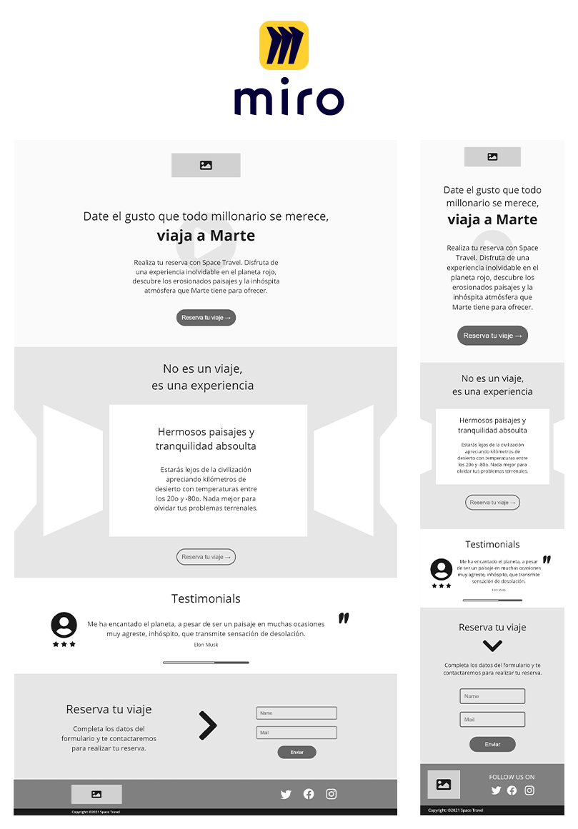
and then I choose to recreate the design digitally by using Miro, as it can be easily shared with
others and have some functions that allows you to use predesigned items.
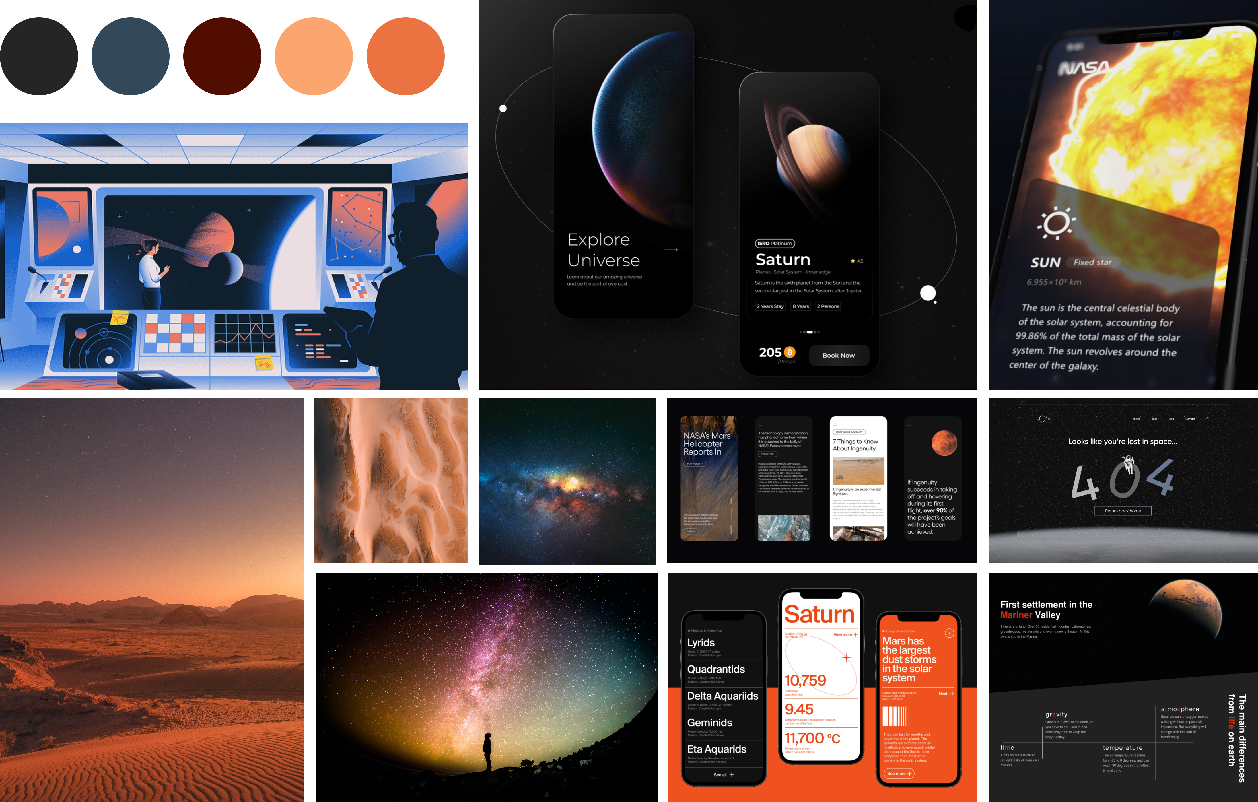
moodboard
Next, I started to search for inspiration that could help me set the mood.
I carefully took into account the brief that we were given while thinking about what to search for,
the goal was clear: to design a landing page that would attract millionares by its elegant
and
minimalistic style, and that would fascinate them by creating a bit of mystery around this
amazing
trip to the red planet.
I started by looking for similar digital projects and found some interesting ones related to space
and planets, and then moved to some pictures, illustrations and photos that would represent visually
the outer world.
Below you can see the result of my search condensed in a moodboard.
style
— TYPOGRAPHY
Then it was time to make some explorations with fonts. to find a good combination for titles and body that would be able to convey the same elegant and futuristic mood that I wanted for my design. I made lots of variants and tested them out with a few people to see which one they found clear and undestandable and at the same time would suggest them a space theme.
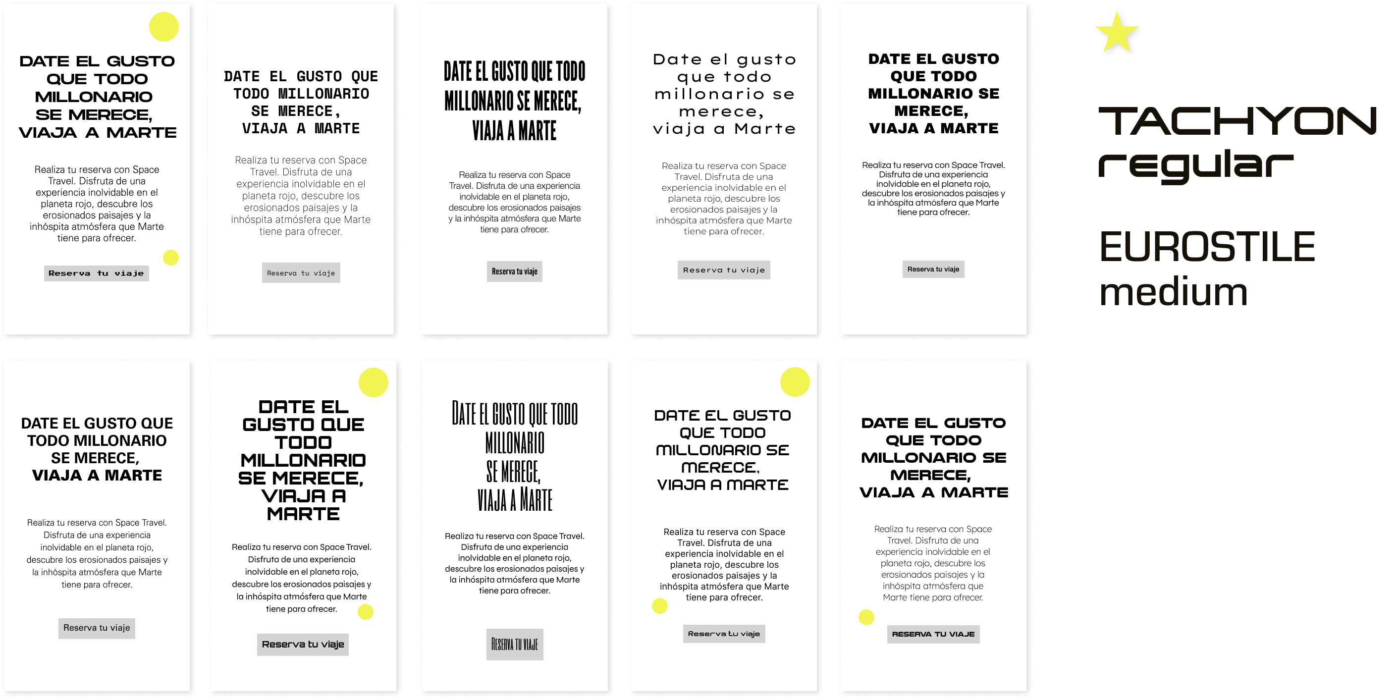
The final choice was to use Tachyon Regular for headings and Eurostile Medium for the body. After a few test and visual application in context to find just the right combination of fonts, I went for these two because the feedback I received about them was that they are able to convey a technological and futuristic feeling while keeping an elegant design, which is exactly what I was looking for.
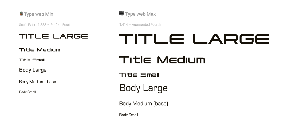
— TYPESCALE
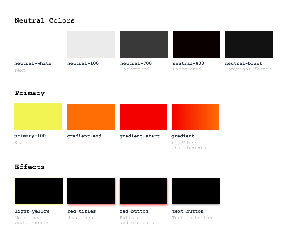
— COLOR PALETTE
I tried to apply to some example designs different options for the color palette, which were inspired by from the moodboard, all with a marked contrast among the elements, but still with a dark and elegant feeling. At the end I decided to go with the one that is clearly bringing back the colors of the red planet, as since it was a landing page, I wanted it to be easily distinguishable and associated to Mars.
I selected some orange-red tones that would be the base for the main elements and texts of landing page, and that would work together with the primary tones, mainly dark ranging from deep grey to dark red, which would be used for the background, to represent the idea of outer space.
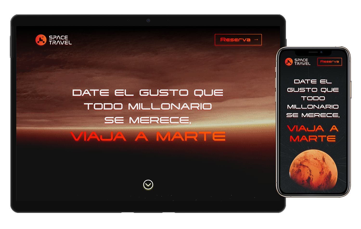
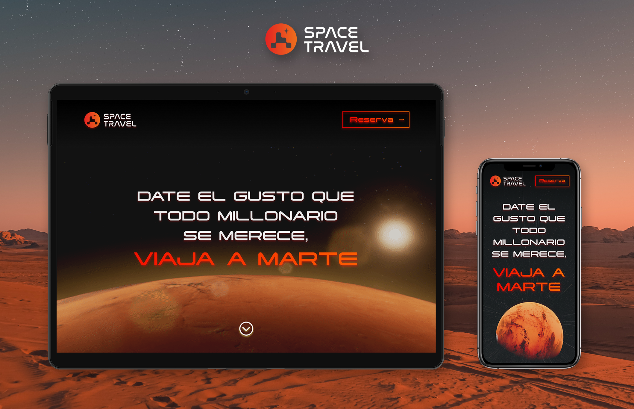
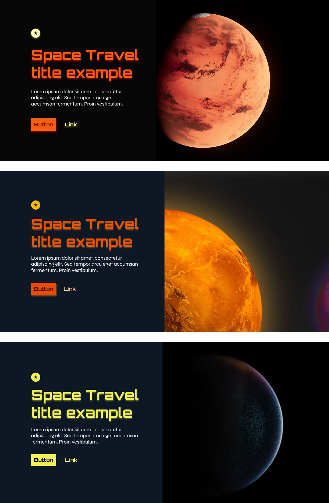
prototype
Last but not least, after tests, trials, and errors, I came up with the final design adapted both for
mobile and desktop which would include all the sections required from the briefing and a clear CTA
that invites the users to register and book their next trip to Mars. You can see below the two
prototypes developed with Figma to which I added some very basic interactions, as it was a one-page
design.
Along with the landing page, I thought of creating the logo for my travel agency as it could help me
to convey with its shape and colors the aim of the project, but as this wasn't a branding excercise,
I decided to show here only the final result in context.
Please, enjoy! :)