-
SEARCH ON ACT
-
Digital Product
-
2022

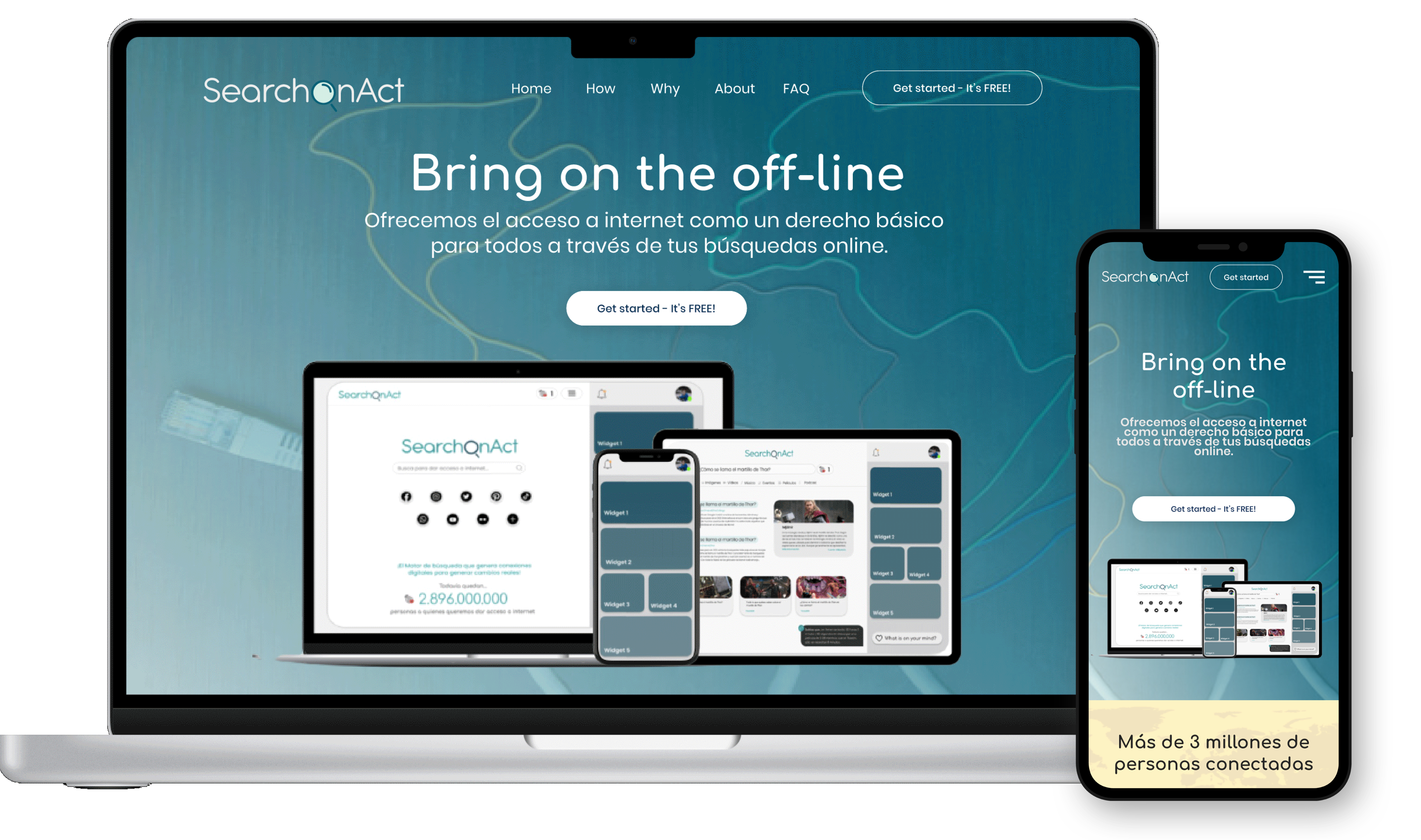
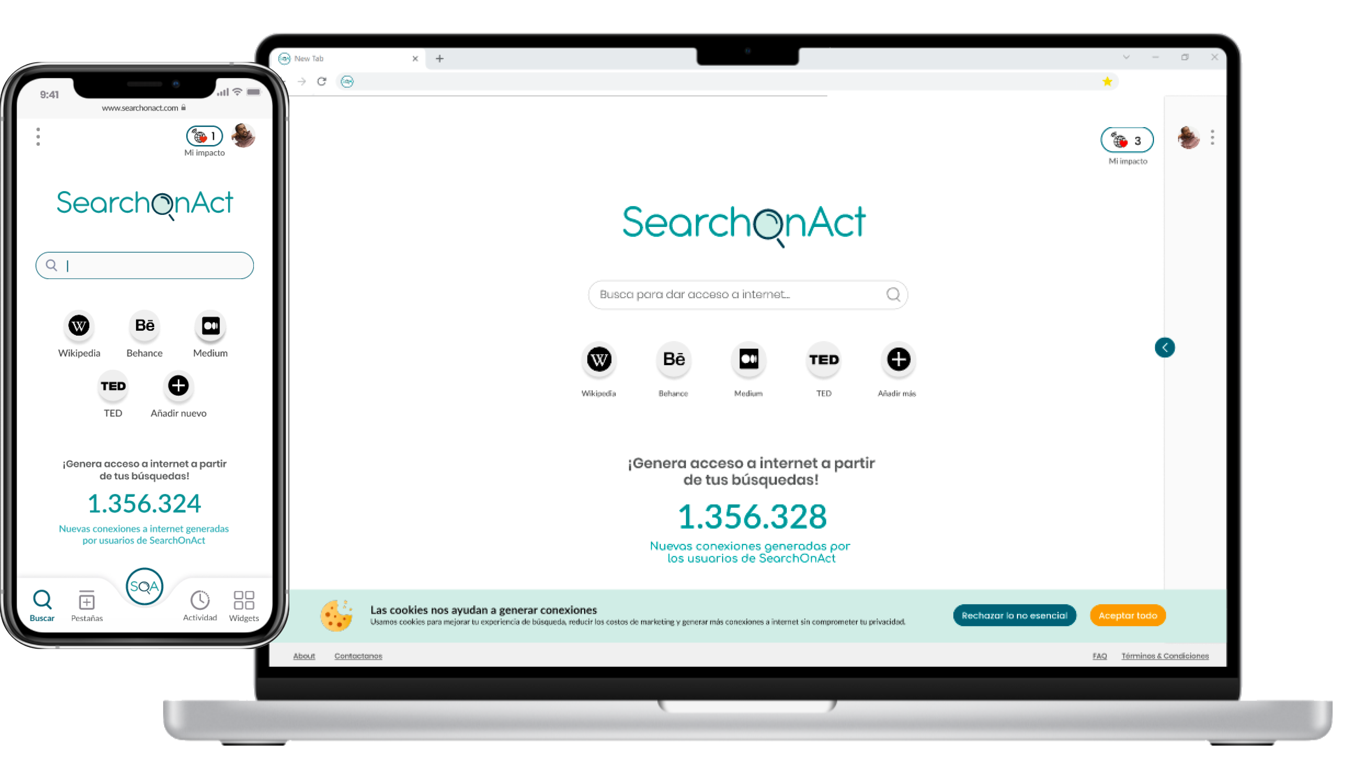
SearchOnAct: the intuitive, interactive, and alternative browser that transforms your daily online searches into internet access for the 2.9 billion people who still don't have it nowadays by connecting us with social partners and NGOs and transforming your clicks into global benefits.
Go directly to the project's sections:

Design process
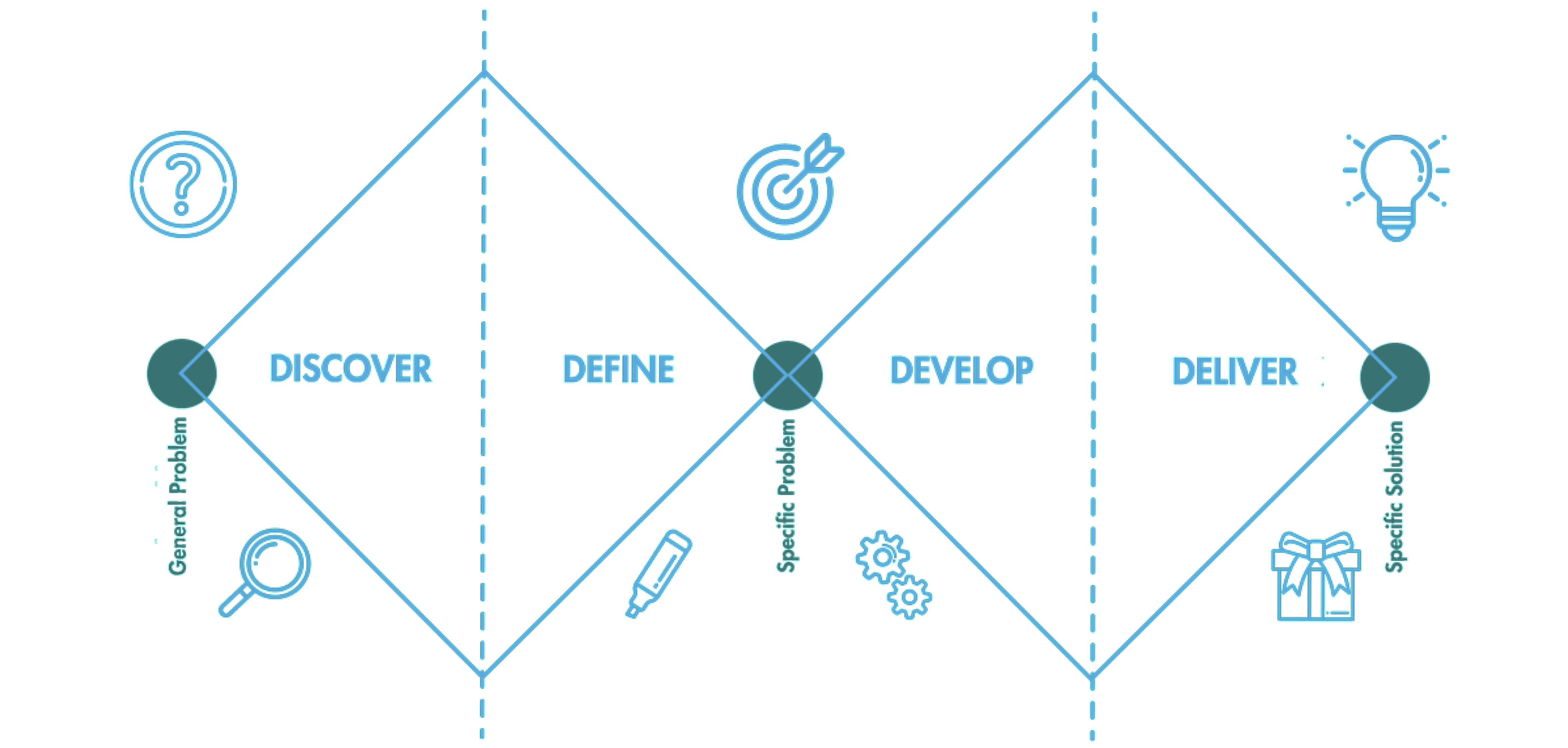
To structure the whole design process of this digital product developed by a group of three designers as the final project of the Master in Digital Experience Design at BAU Design University of Barcelona, we have used Design Thinking and in particular, the four phases of the Double Diamond model, which have allowed us to go from the first stage of understanding and defining the problem detected in the field of privacy and culture, to the proposal of a solution that can deliver value and contribute to solving the problem.

Discover
— THE DIGITAL GAP
The problem that we decide to investigate is the one generated by the digital divide.
The digital divide refers to the inequality in access, use, or impact of Information and
Communication Technologies (ICT) between social groups.
Traditionally considered primarily a question of access, today, with global cell phone penetration
at over 95%, inequalities arise between those with more and less bandwidth and more or less
associated technological skills.
Inequality in access to technology is also a form of social exclusion, especially in times of
COVID-19. To the extent that we smooth this fissure, we are underpinning a more secure structure for
people. Empowering people in vulnerable situations increases their autonomy, promotes equality, and
makes us better as a society.
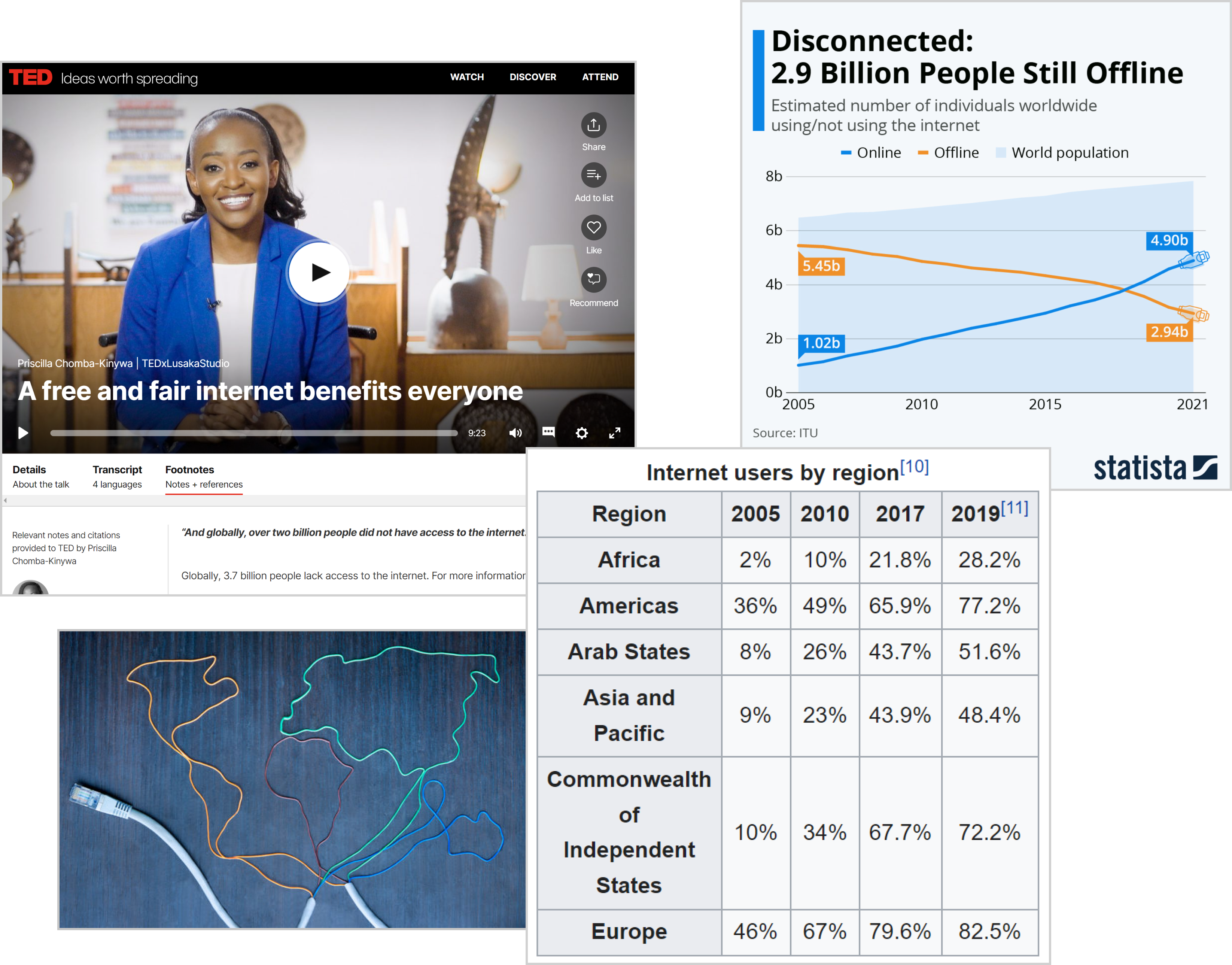
— THE ACTUAL CONTEXT
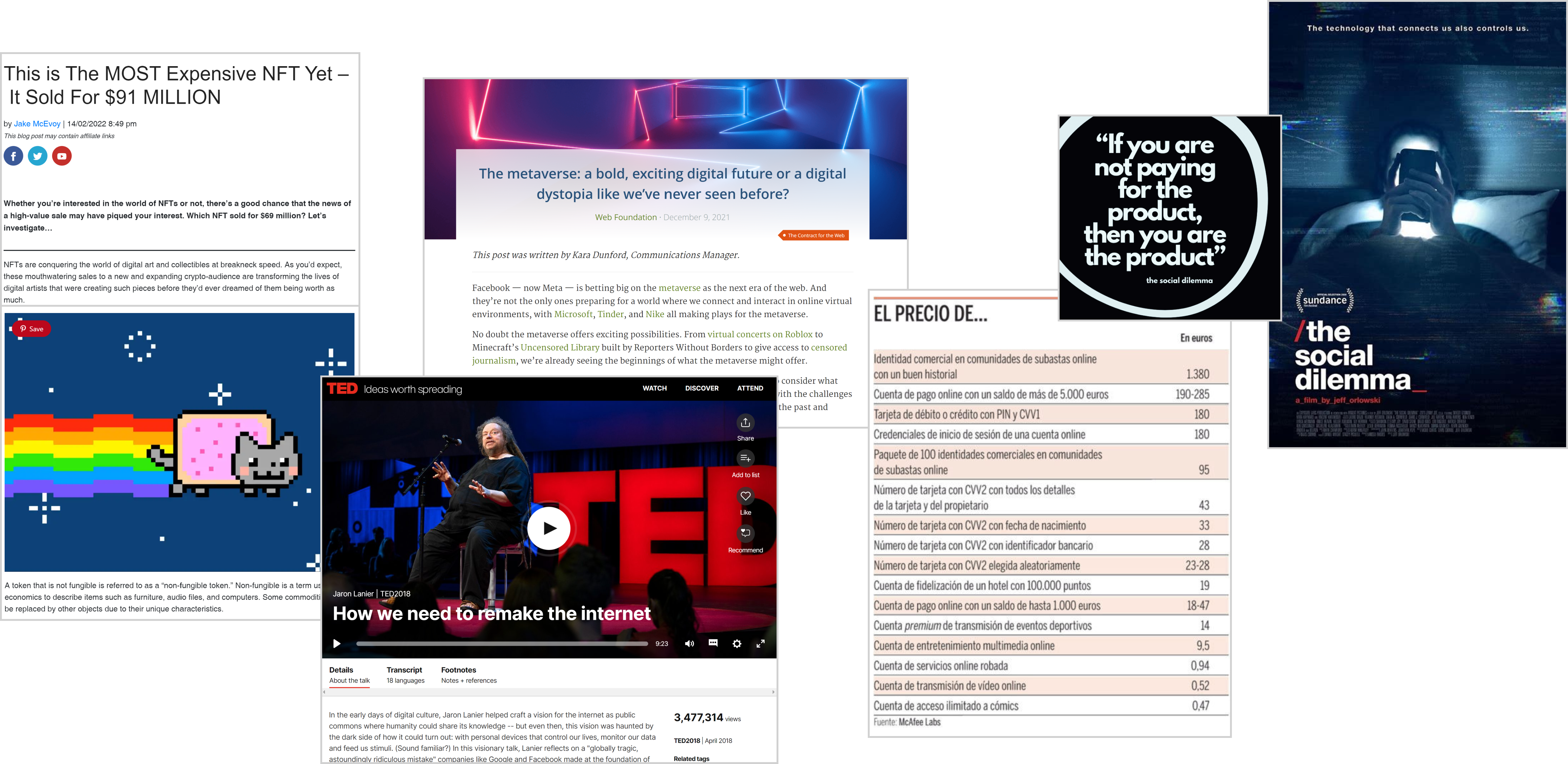
One of the first things that we discovered by starting to interview people about their digital experiences related to culture, was the duality between what people say and what they actually do when they are on these digital platforms sharing their data and accepting everything, even without knowing exactly what companies do with their personal information. We heard stories about people willing to pay millions for immaterial things like NFTs or to buy expensive things in the metaverse, when they didn't know and don't even realize that we are facing a real tangible problem that is affecting 2.9 billion people who still don't access to the internet today.
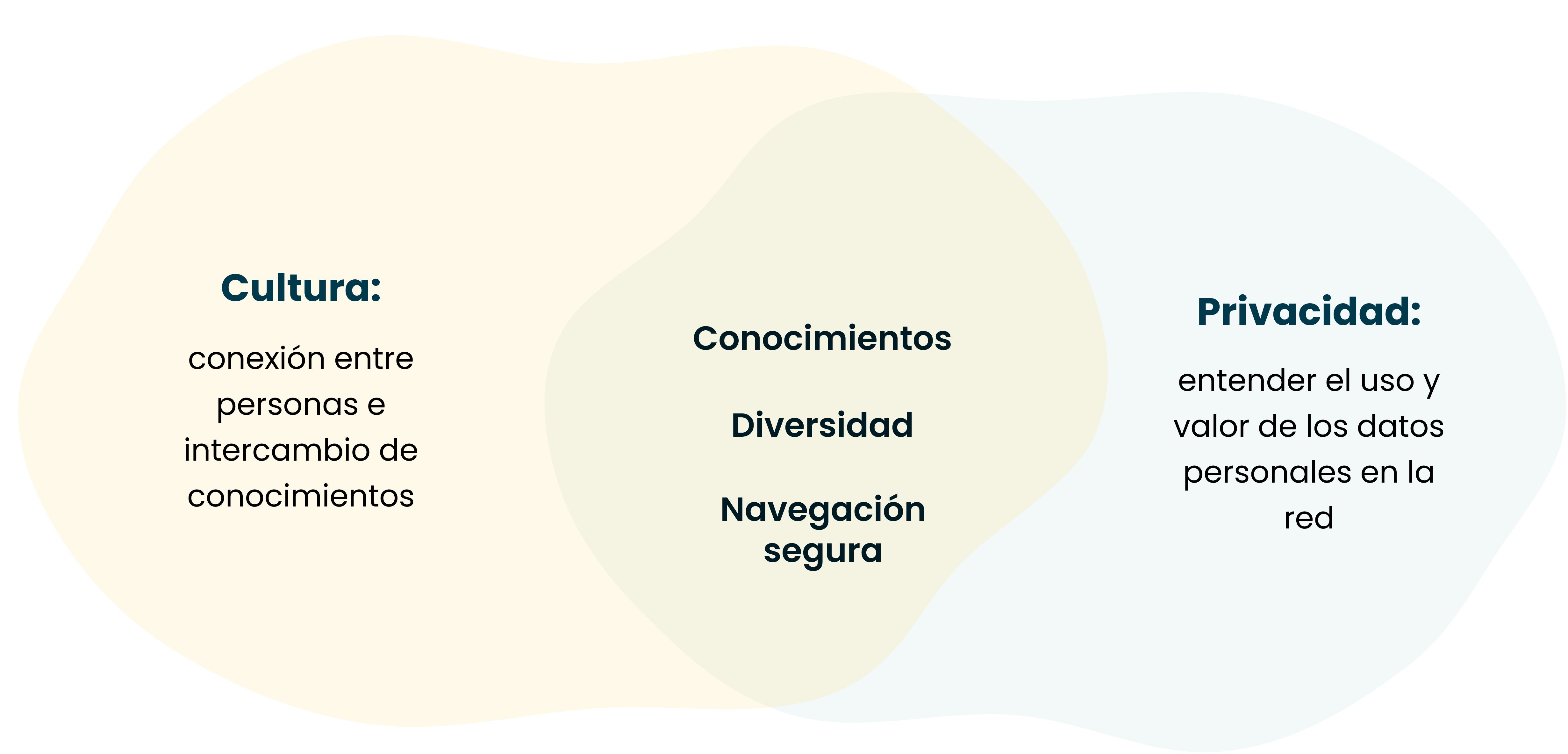
— Privacy and culture as...
At this point, we have arrived at our definition of the two main themes of the project: "culture" as a connection between people and knowledge sharing and "privacy" as understanding the use and value of personal data on the net. We linked these 2 areas and came up with terms such as connection, knowledge, diversity, and safe navigation.
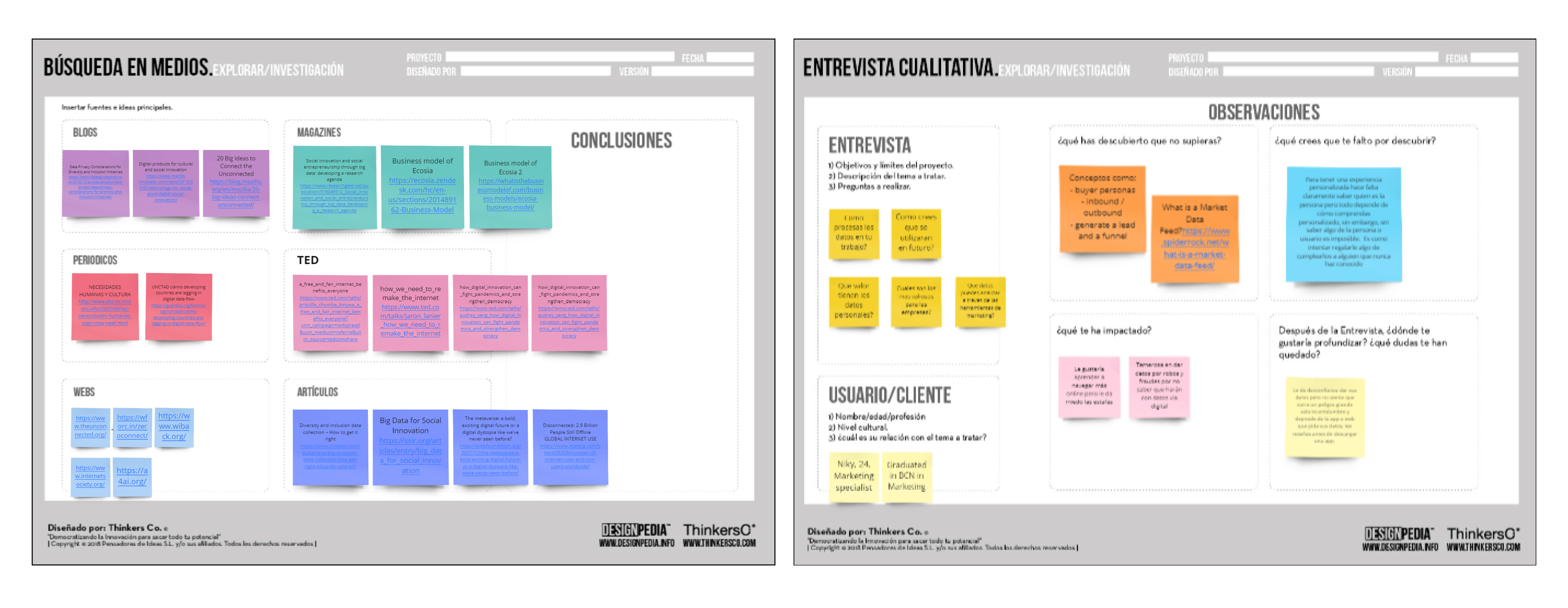
— Applied discovery methodologies
In this first phase, we did more than 20 interviews that allowed us to get into context, hear
directly
from people their thoughts and concerns, and in this way develop empathy.
We also found it very helpful to do extensive research on different channels - such as articles,
blogs, videos, recorded interviews, and podcasts - to be able to understand and adopt the point of
view of other main actors involved in this problem, which we might never have been able to meet
physically.
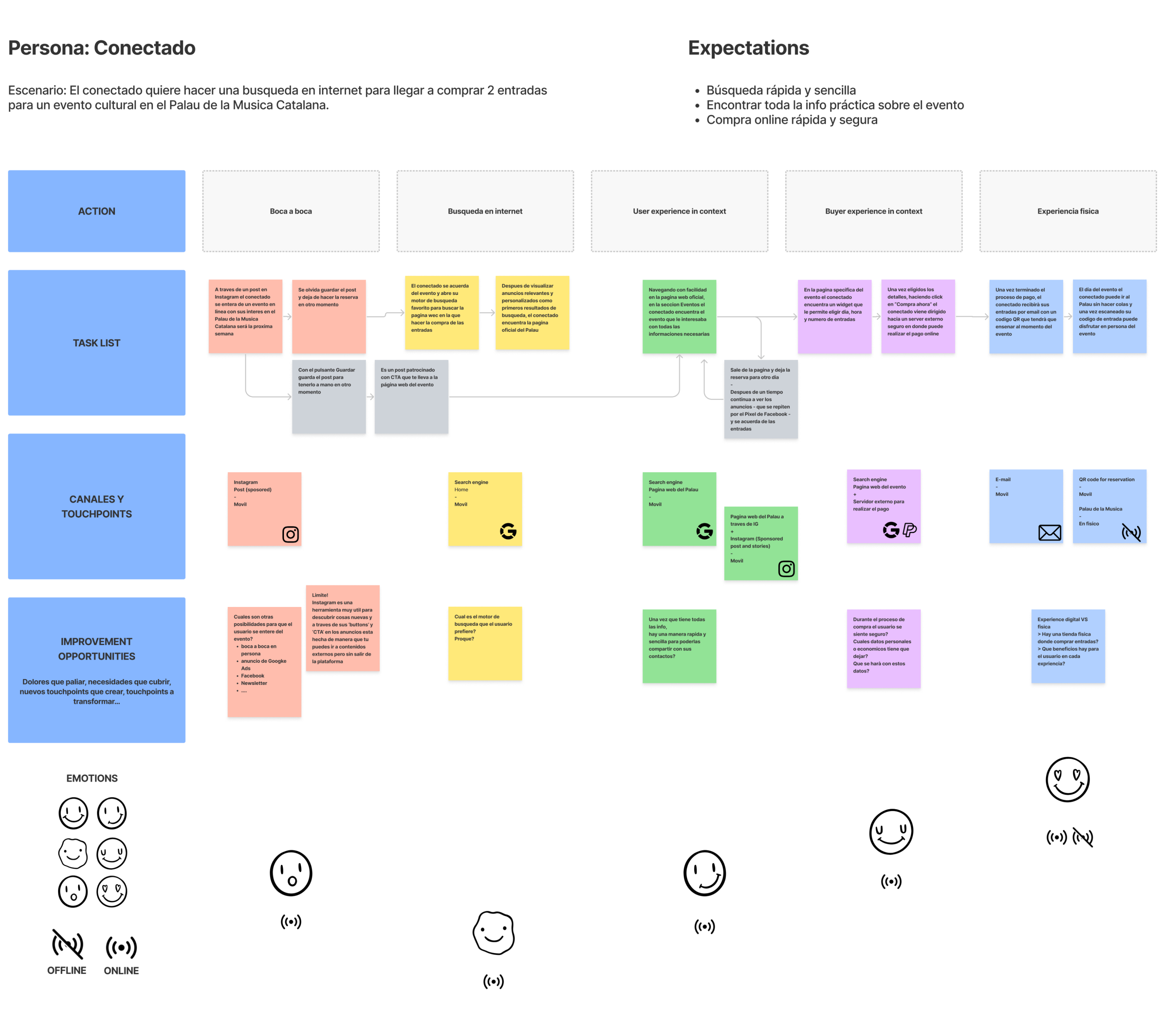
Finally, a very important tool was the creation of several Customer Journey Maps about
digital shopping experiences
for cultural events, as an example of an online moment where personalization is sought.
With this, we realized that in all of our user's customer journey maps a vicious circle is generated
in which there are always the
same big digital companies that put their own benefits before people's real needs, thus
contributing to widening the digital divide.
— Applied discovery methodologies
Finally, a very important tool was the creation of several CJMaps about digital shopping experiences for cultural events, as an example of an online moment where personalization is sought. With this, we realized that in all CJMs a vicious circle is generated in which there are always the same big companies that put forward their own benefits, thus widening the digital divide.

Define
After the first phase in which we were able to get deep into the context and get precious insights by talking to lots of people, we started the second phase by starting to define all that we have discovered to really understand and narrow down the problem.
— Chosen archetypes
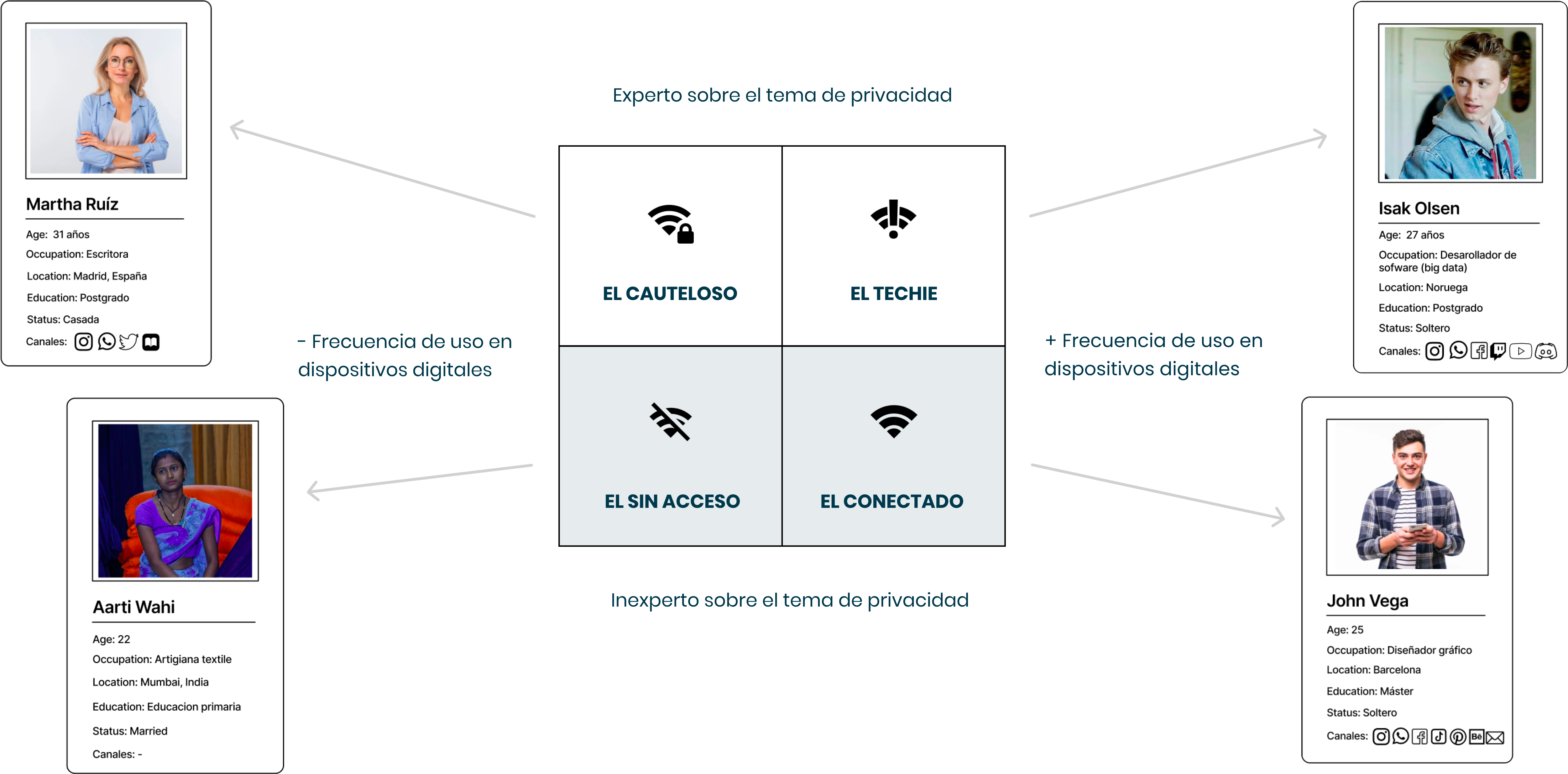
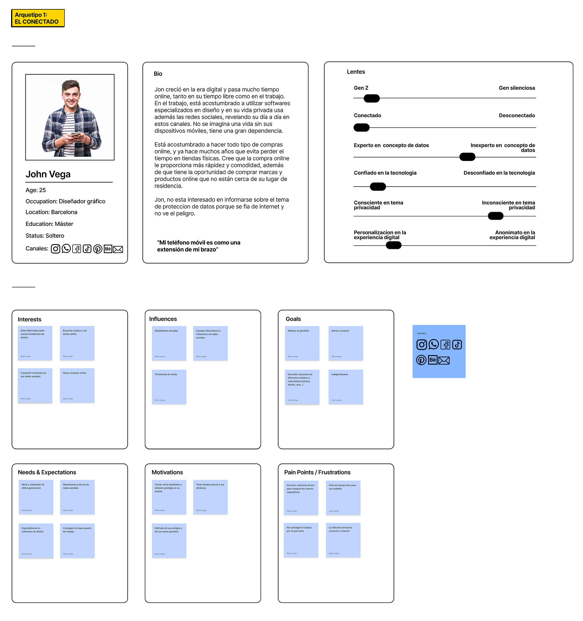
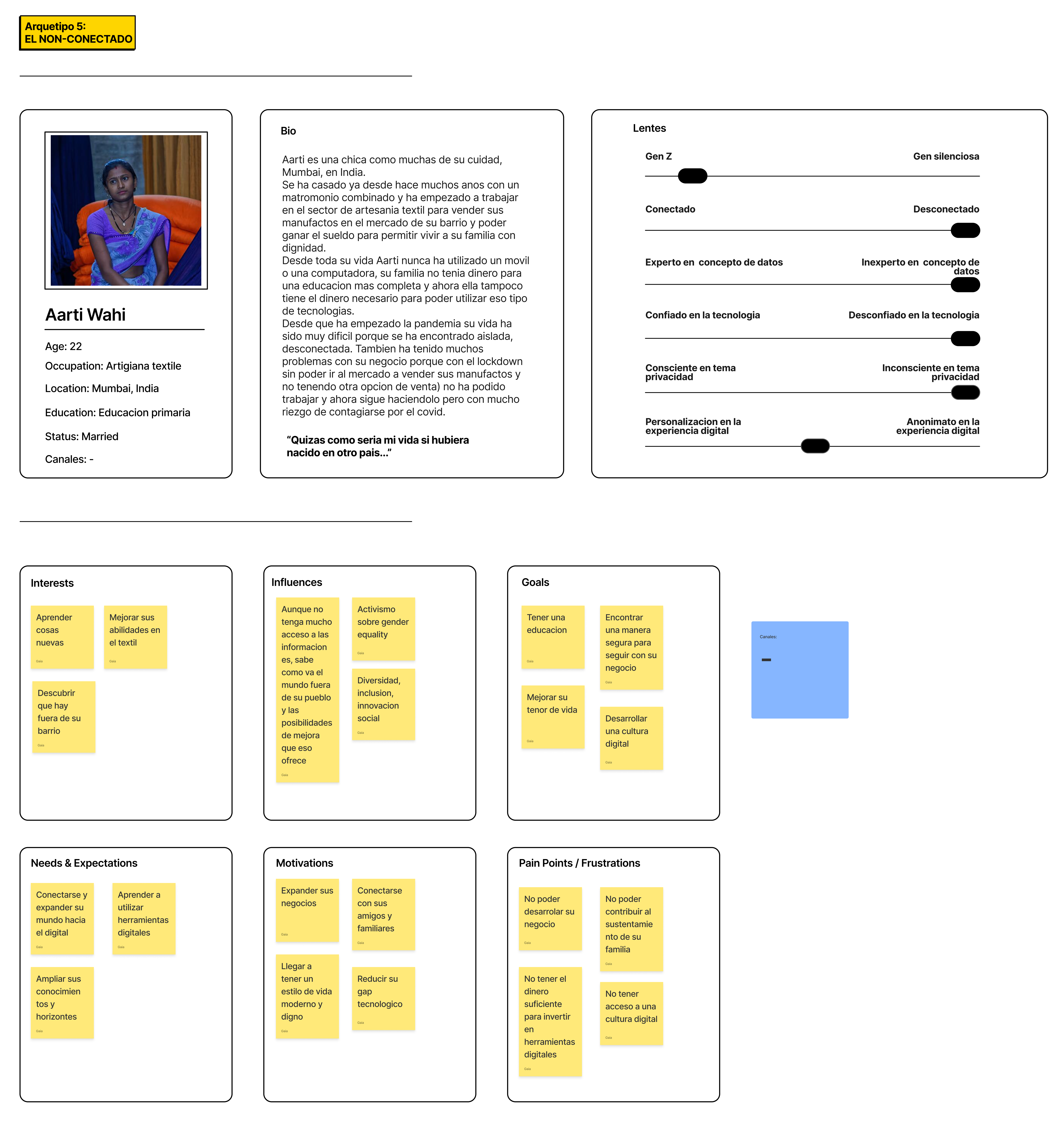
We started by defining our archetypes, our model users, by using a matrix in which we used two lenses: people's knowledge about privacy and their frequency of use of digital devices. As you can see in the image below we prioritized 2 archetypes that may be considered opposites, the "always connected" and the "unconnected".
— Target Users and Primary Personas
The next step was to define how the primary personas of our product.
They would be:
- web users with internet access located all over the world, who
search the internet to consume visual, informative, and cultural content.
- constantly connected people, regular internet users who use their mobile or computer to perform
daily searches.
- they usually "accept everything" before accessing a digital service because they think that
nowadays
"privacy no longer exists".
- they are aware of the problem of the digital divide and have a moral sense of social
responsibility,
they value to have the possibility to generate social benefits through their actions.

— Insight and Challenges
At this point, from everything we discovered in the discovery phase, we collect insights and
prioritize
them in order to define a how might we scenario together with our main challenges. We
developed 5 insights and for each of them, we described a how might we question, which later on we
reduced to two main challenges as they were considered the most relevant also by our users.
∗ How might we transform this "legal obligation" to accept terms and conditions into benefits
for
the
community and not only for companies?
∗ How might we act within the digital transformation of culture so that everyone can be
connected
for
free and unlimitedly?
Or in other words: how can we restore the true value of our individual privacy by acting within the
digital world?
It was at this point that we started to look for a way that would allow digital users to continue
with exactly the same as they normally do in
all digital experiences, more specifically to use services in exchange for their personal data and
preferences, but by using the
legal obligation to share valuable data and transforming it into a possibility to generate revenue
to concretely solve the problem of the digital divide.
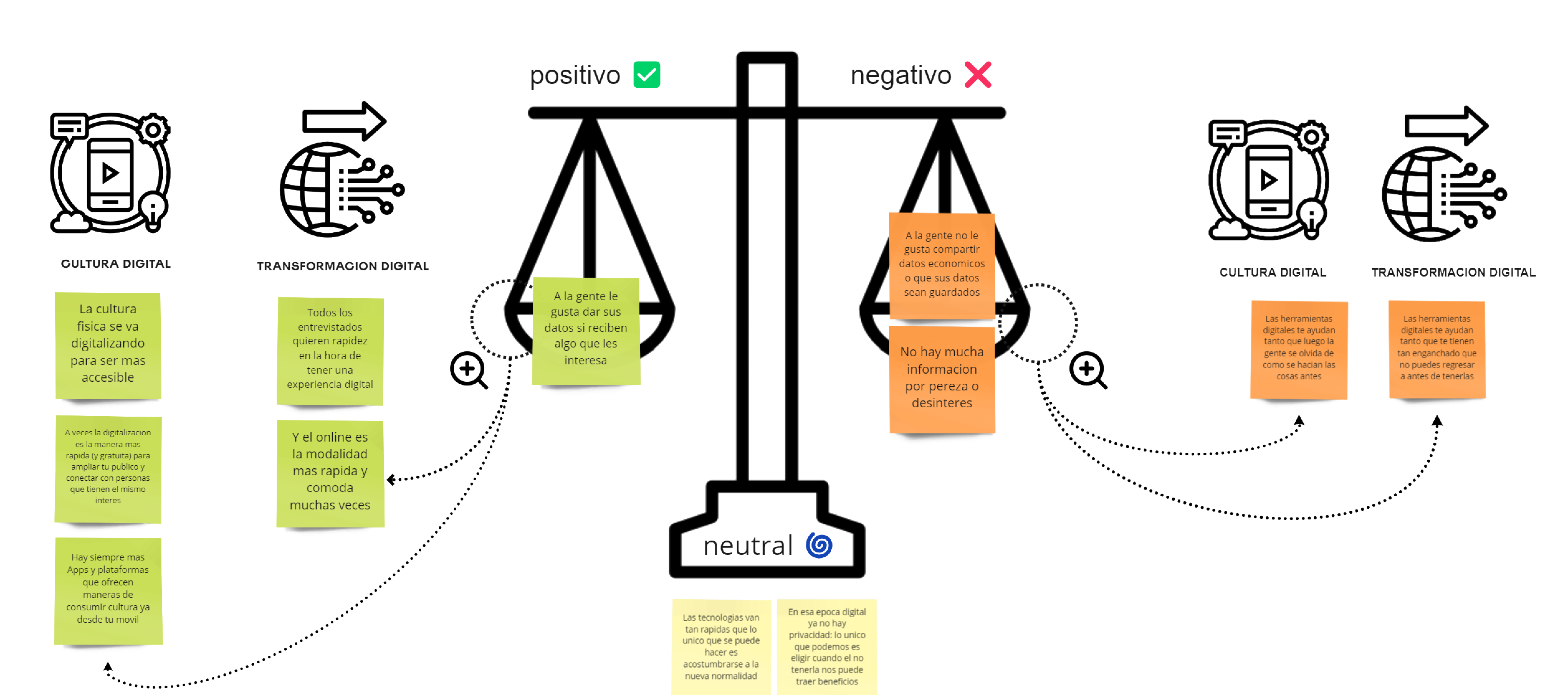
Below you can see a visual summary of these two first stages that we created to represent the
outcomes through storytelling.

Develop
It was with these premises that we started the third phase of ideation.
— Brainstorming
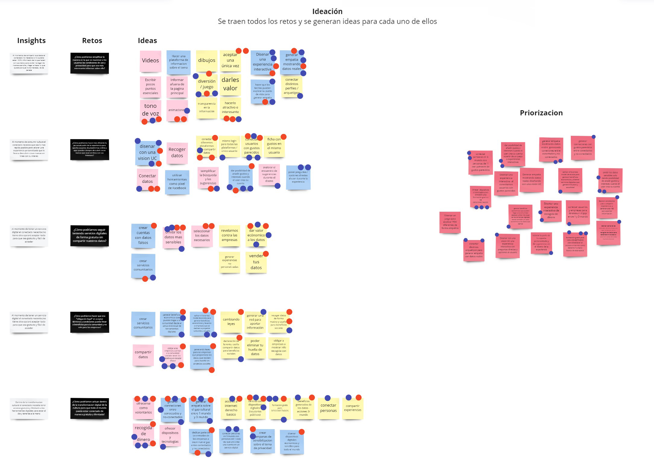
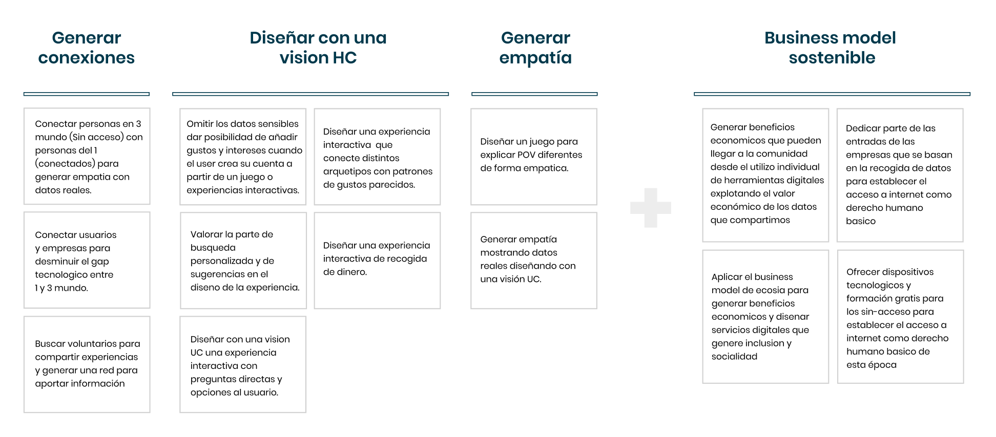
The first thing to do at this point, once we had a clear vision of the whole scenario, was to start and generate the most possible ideas on how we might resolve the defined problem. At this stage together with the class group, we had a bnrainstorming session, through which we collected several ideas and then we prioritized them and cclustered them into 4 main themes thanks to an affinity map through which we selected the ones that we thought could bring more value to our users and so deliver the best solution.
— User needs
It was necessary at this point to also write down our user's needs to understand how we could solve
them through our idea.
What we found out to be our users' needs are:
∗ Speed, ease, and fluidity in their digital experiences
∗ To have a safe navigation
∗ Find results that match their tastes
∗ To see visually attractive ADSs that explain the value they can provide
∗ To understand and visualize the value of their privacy to generate a real change
— Benchmark
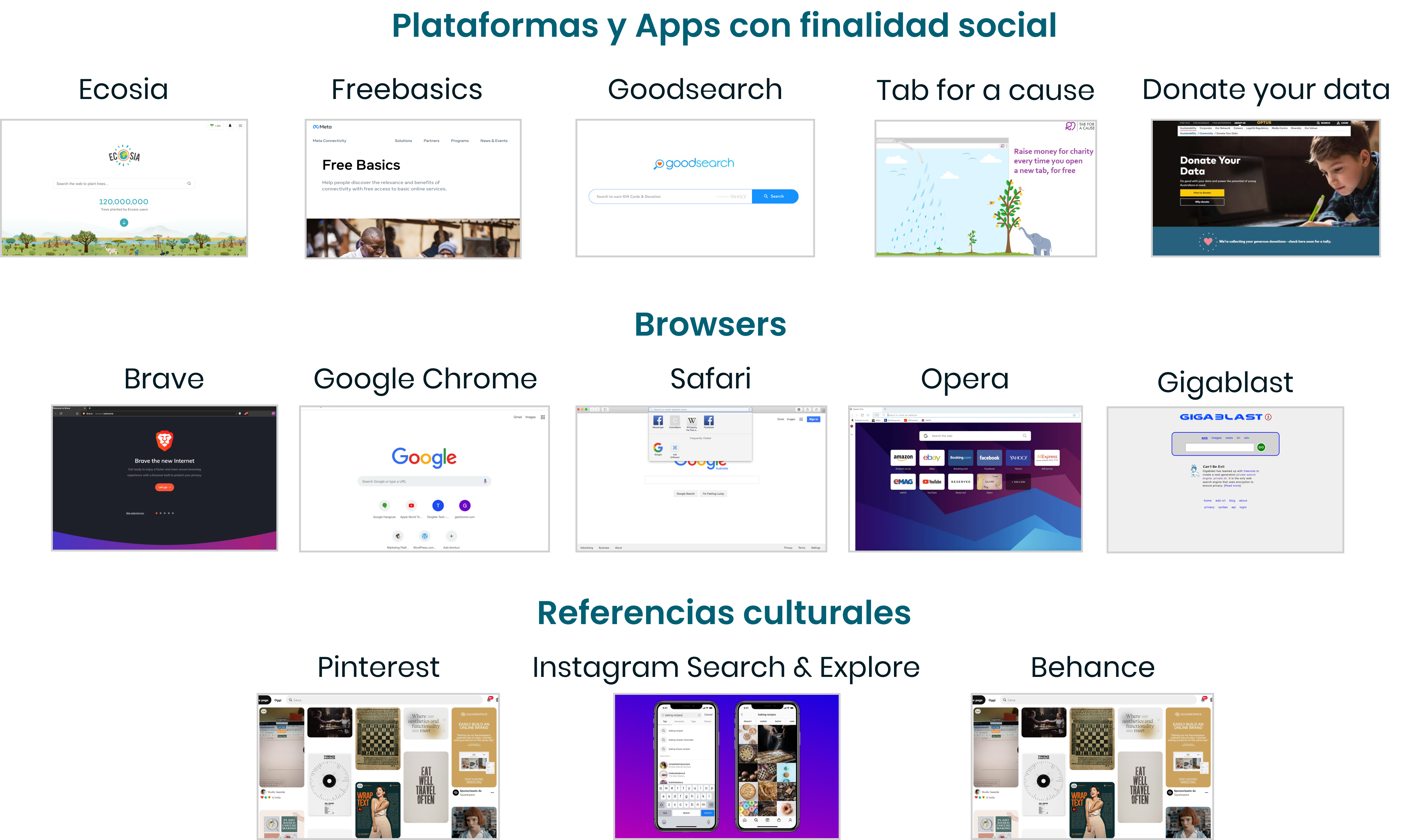
Then, we did a market study whose outcomes were divided into 3 main categories, which helped us to
see
and understand the current competition and how they
are performing within the digital transformation.
As you can see in the image below, we have:
∗ Platforms and Apps with a social purpose, where Ecosia is our main competitor
∗ Browsers, from the most used to brave, the most innovative in terms of privacy protection, to
Gigablast, the most basic that helped us to see what an MVP (minimum viable product) should offer
∗ Cultural references > the most popular platforms that offer cultural contents according to our
users
Unlike big companies that use your data for their own profit, we securely use your data to
generate a global social benefit!
Instead of keeping all the revenue like other search engines, we give a portion to our
non-profit
partners to finance social projects that generate internet access for unconnected
people.
And you don't have to change your habits to do that, SearchOnAct allows you to change the world
while going about your daily life: every time you search the web, you can offer a new Internet
connection to people who don't have one yet.
It's also free and costs nothing because the money raised comes from ads in search results.
Moreover, to allow a safe experience, we take care of your privacy and your personal data during
the
whole navigation as we explain it simply and understandably to everyone on our website.
Last but not least, we want to offer a unique digital experience through an interactive and
customizable interface to generate cultural knowledge, information, sociality, empathy, and
debate on
the topic of the digital divide.

The * represents our project and where we want to position on the market.
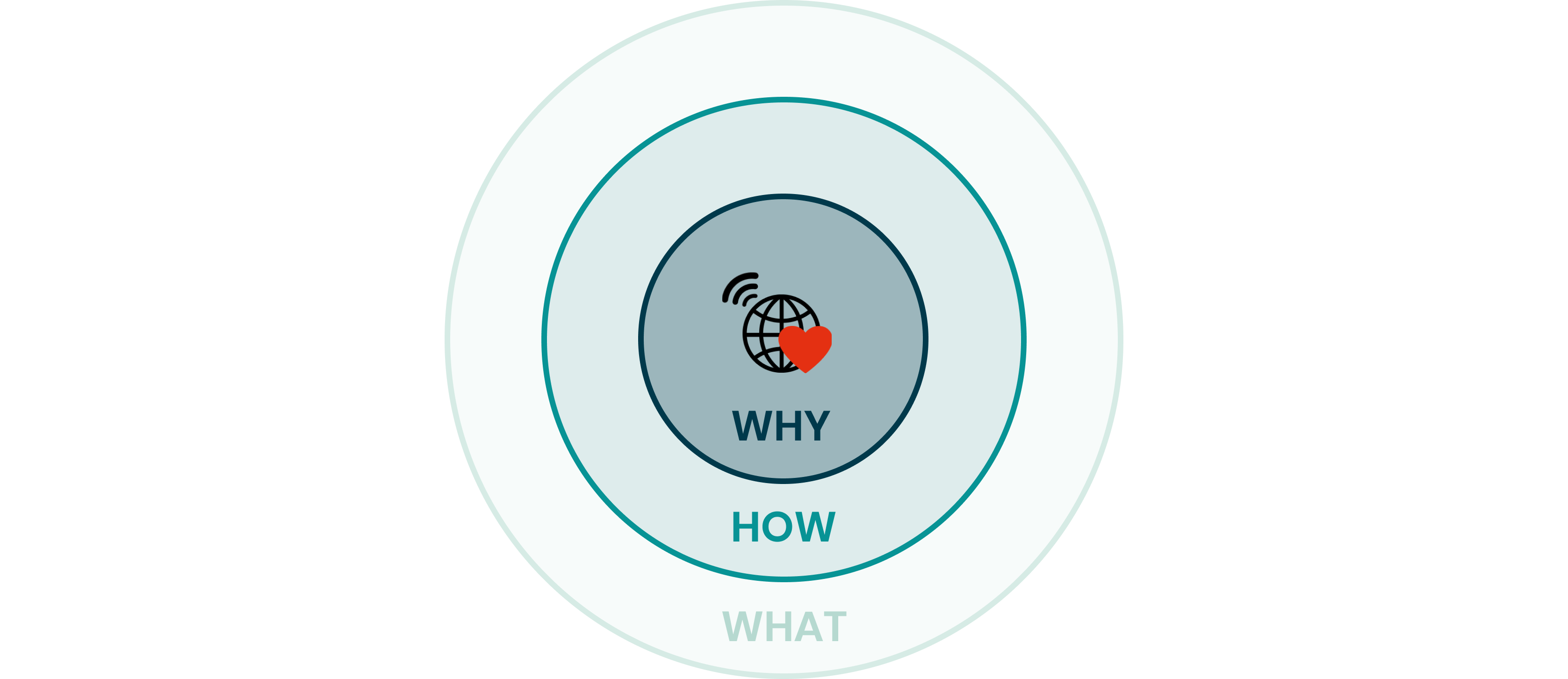
— The Golden Circle - Unique Value Proposition
At this point it was simple and necessary to summarize our process into a golden circle that could
represent our idea and its unique value proposition:
WHAT
We offer internet access to the 2.9 billion people worldwide who still don't have it every time you
surf the web.
HOW
Through an interactive, secure, free, and intuitive online search engine that transforms every click
into economic income for the social projects of partners such as NGOs that provide Internet access
to people who don't have it.
WHY
We want to demonstrate that there is a fairer way of doing business, putting people first and making
internet access a basic right of our era.
— Naming
To briefly explain the naming that we came up with at this stage, we have called our product
SearchOnAct because it contains all the concepts we defined so far: it contains the action we invite
you to do (search), plus a magnifying glass that reinforces visually the message.
Moreover, in the slogan that we chose, we wanted to play with the contrast of ON/OFF and relate it
to the metaphor of connected vs unconnected people.
Finally, we wanted it to be in English because of the global target that we wanted to reach.

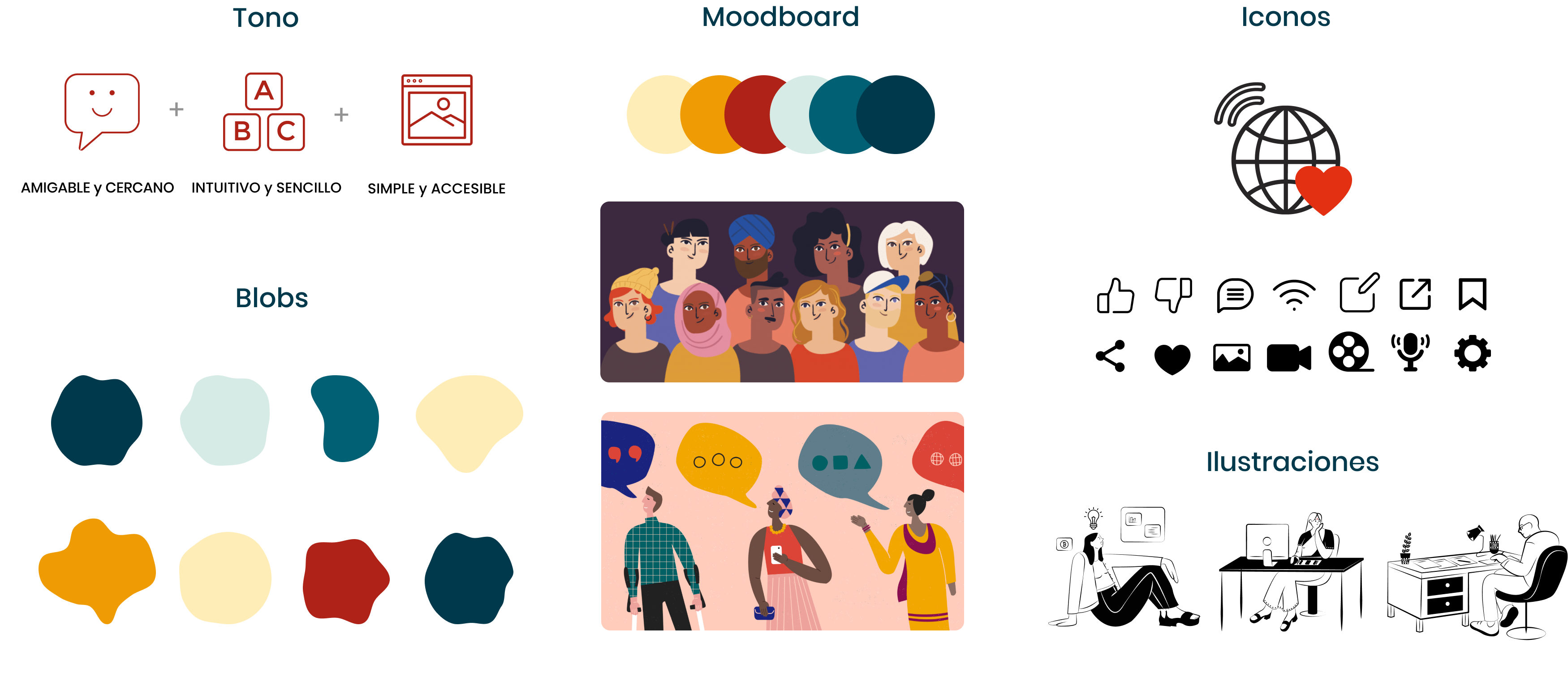
— Design Concept
Through this visual moodboard you can see what do we wanted to convey and how we want to convey it.
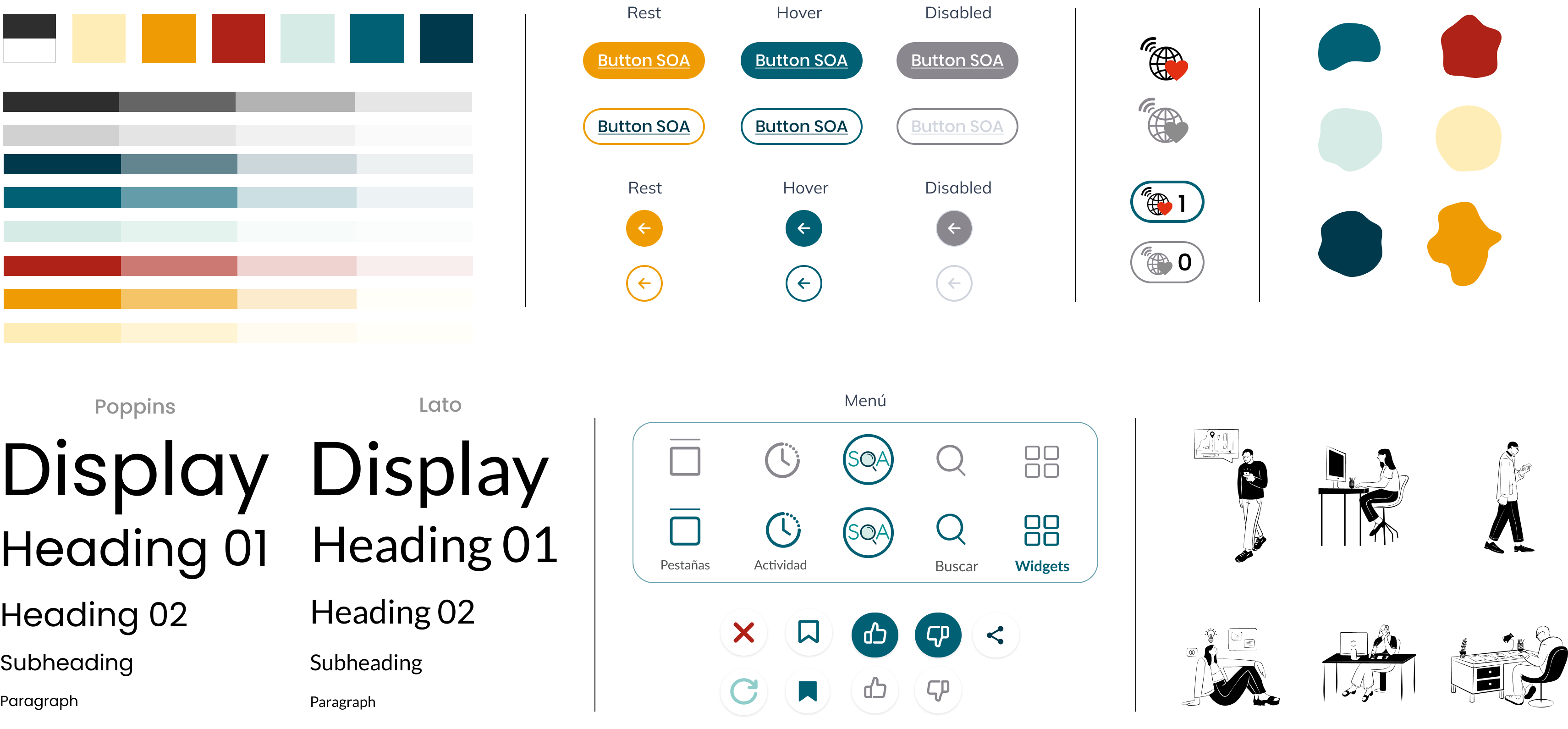
— Design System
Right after defining the design concept, we developed the design system with all the specific colors, typographies, and elements that would have ensured visual coherence in the whole project.

Deliver
Once we defined the concept and the elements that were going to form our project, we started with the last phase of delivery in which we gave a totally digital form to our solution and we have continued creating and validating it constantly with potential users, to always provide to them the maximum value.
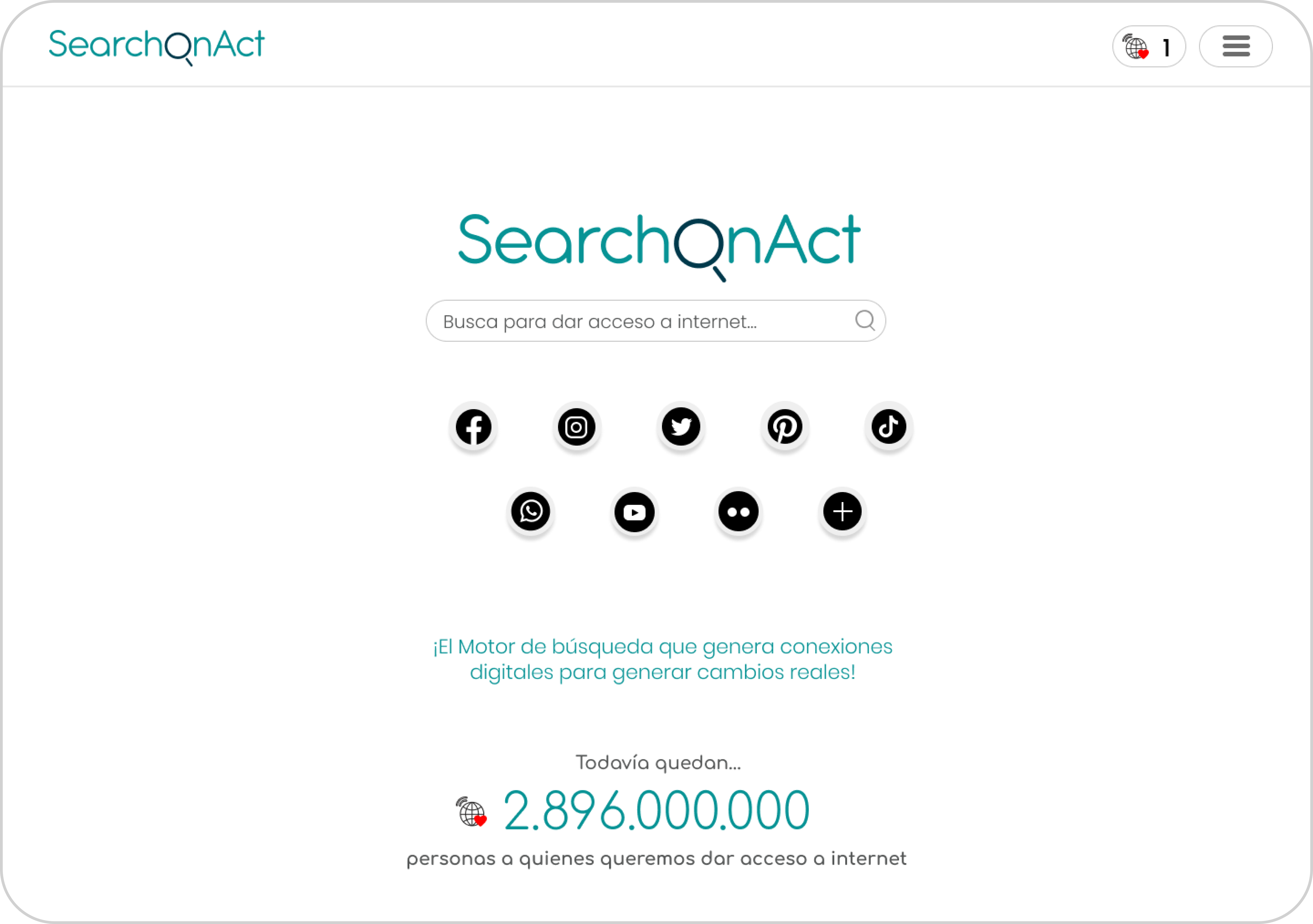
— Introducing SearchOnAct
We didn't reinvent the internet, just the way people can have access to it!
Let's bring on the off-line!
The free, simple, and interactive browser that allows you to change the world while going about your
daily life: every time you search the web, you can offer a new internet connection to people who
don't have it yet, transforming your clicks into concrete actions in support of social projects!
— Wireframes
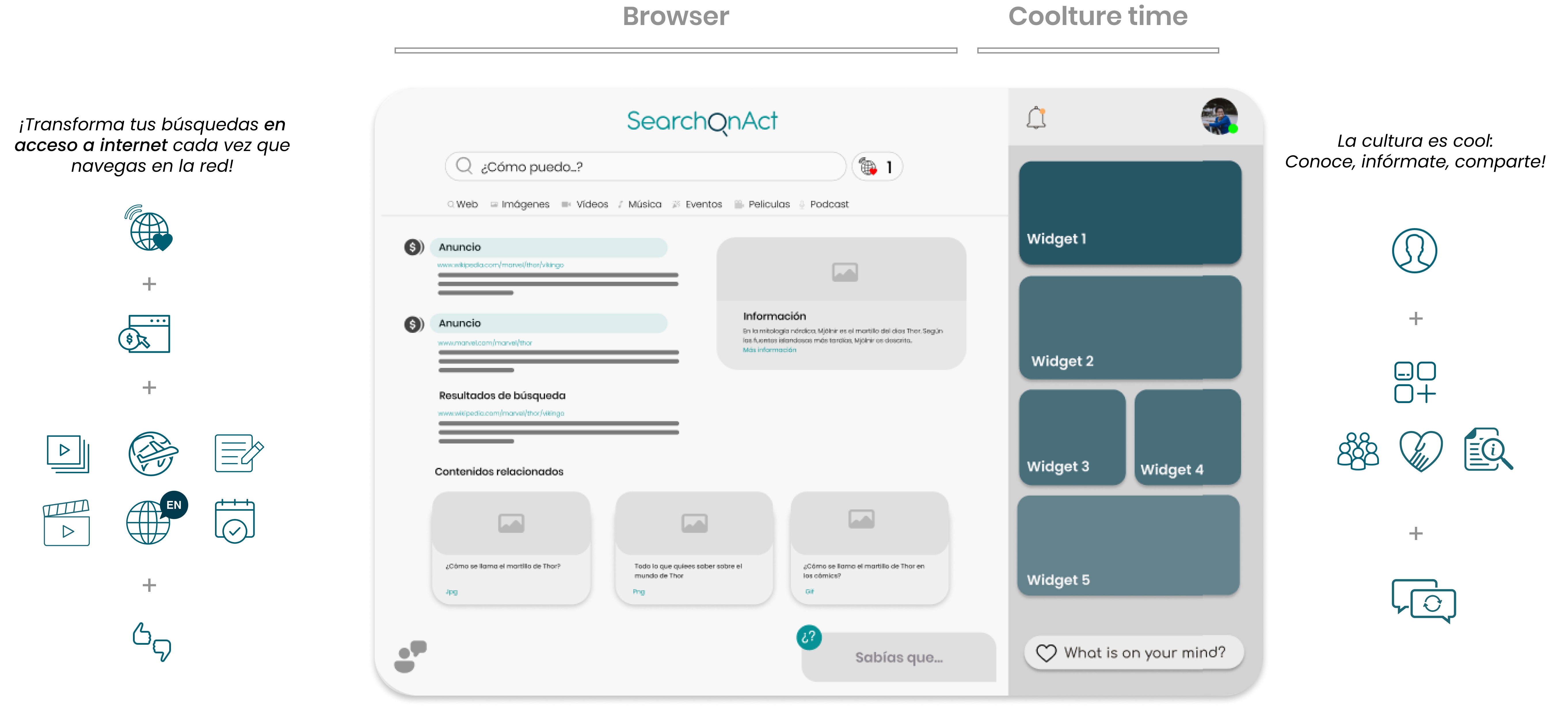
As you can see from the first wireframes, Search On Act consists of two main sections: the
search
engine part +
the coolture time part.
The browser section works mostly like other well-known browsers, you can see results ordered by
categories, such as web, news, images, videos, and so on, while personalization happens through
customized advertisements that appear within the result of your searches and make your "impact" -
represented through a specific icon - grow and so reduce the digital divide by offering new tools
and knowledge to the ones who don't have it, in other words: culture.
The so-called "coolture time" part is designed with the aim of offering a more social, informative
and, entertaining experience to users through many interactive widgets and so develop
consciousness and empathy toward the problem of the digital gap.
— USER TESTING
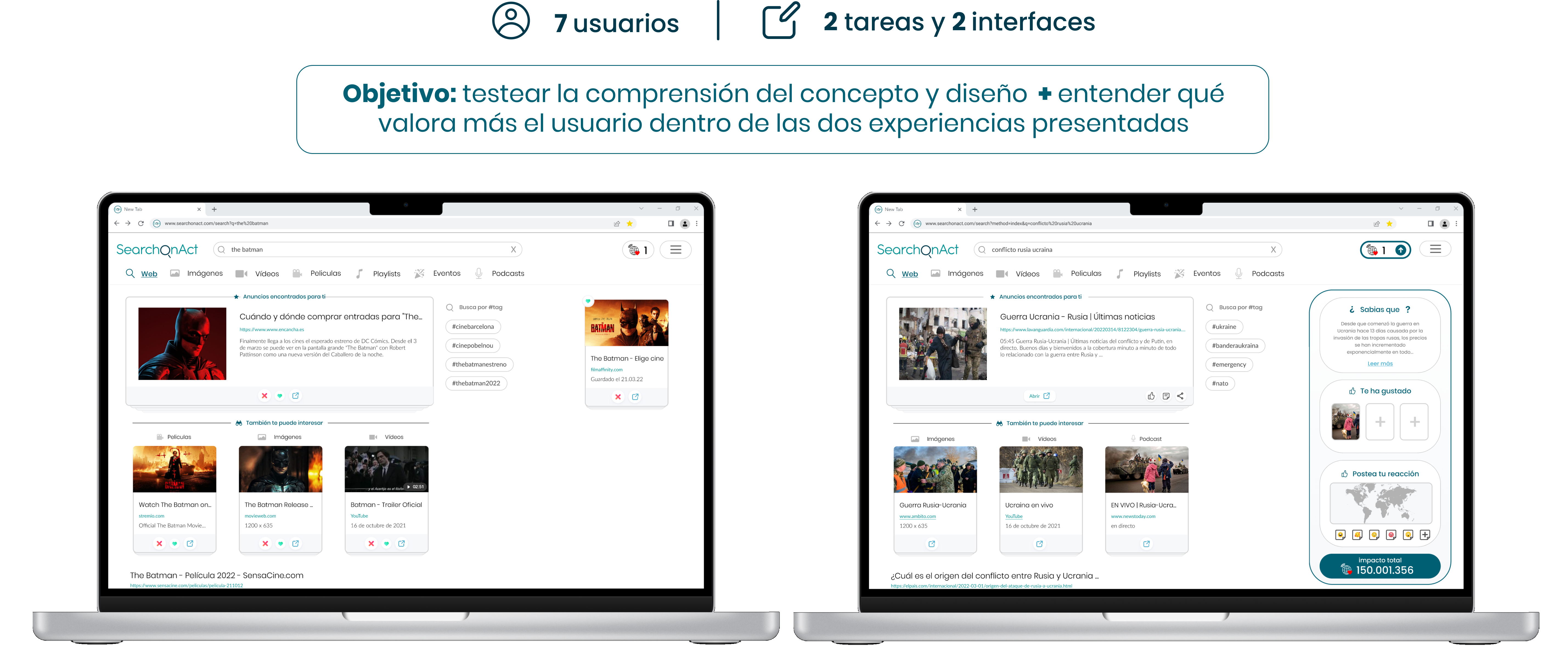
Once we had a clear idea and designed the first low-fidelity prototype, we started to test
directly with our users.
The first tests we did were conducted through 2 different prototypes that represented the 2 parts,
the browser, and the widgets. Our goal was to see if users understood the concept and if they would
have valued having a more social interactive tool while surfing the internet, which the great
majority of the interviewees did.
User tests - Iterating the prototype
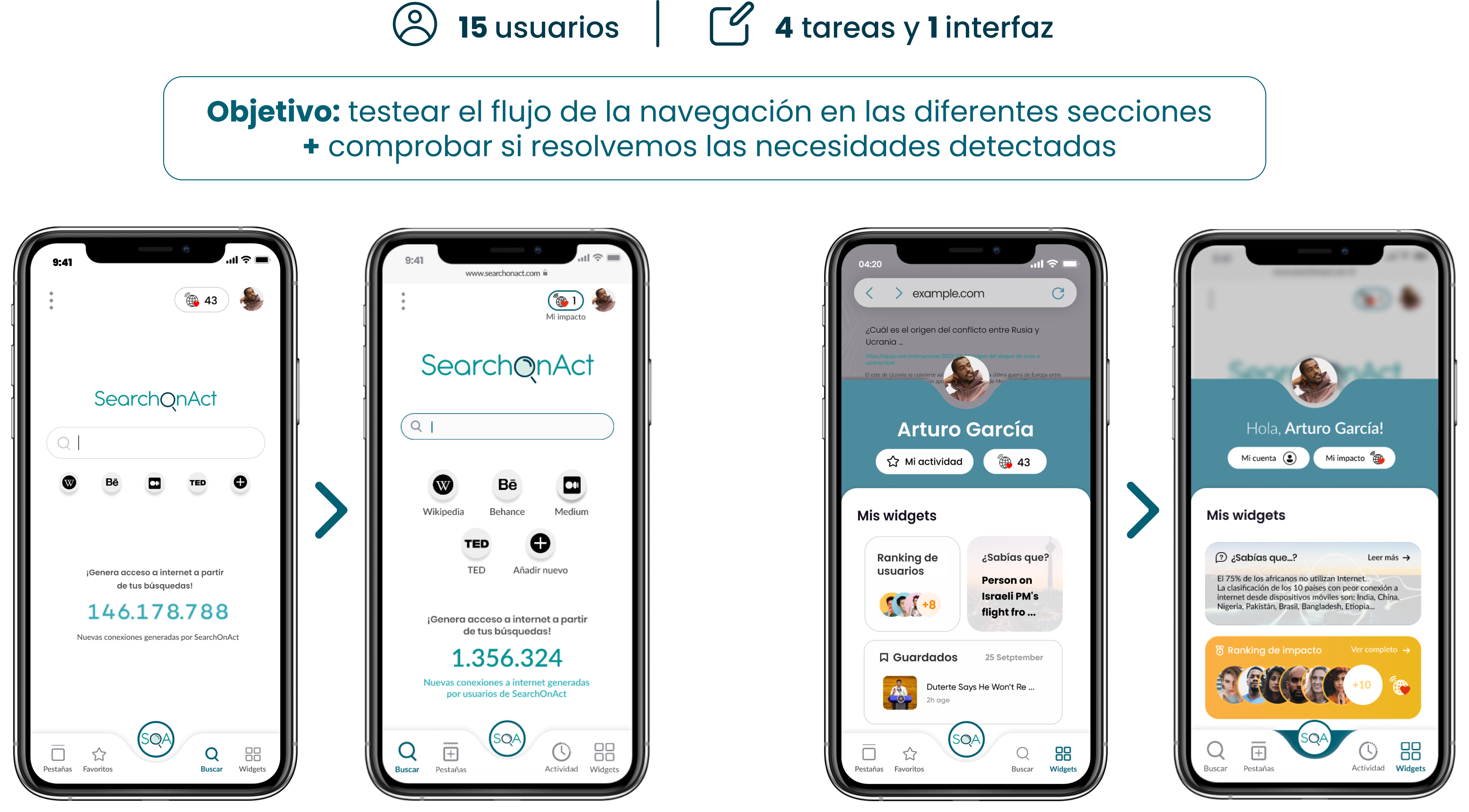
Next, we unified everything in a prototype and started testing the experience with a focus on the
mobile design.
We gave 4 different tasks to perform within the prototype to 15 users.
The goal was to see if the whole navigation flow made sense in the different sections and also to
check if we solved the previously detected needs.
Below you can see briefly the changes we made thanks to these tests since the first version of the
prototype.
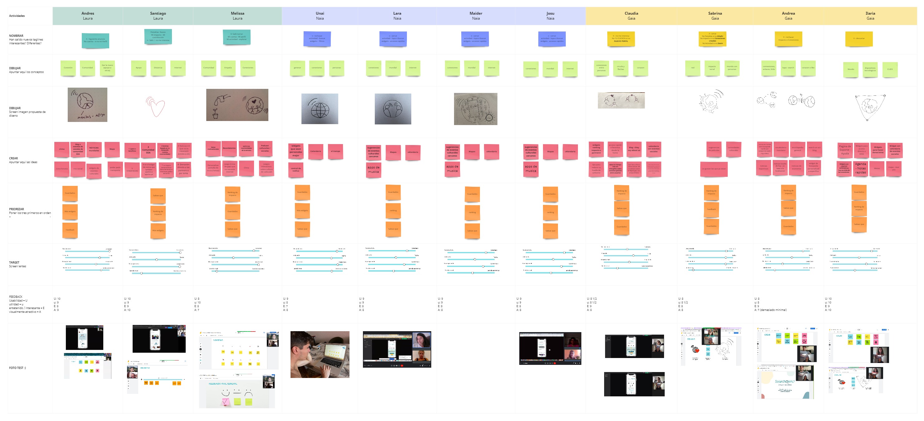
User testing - Co-creation
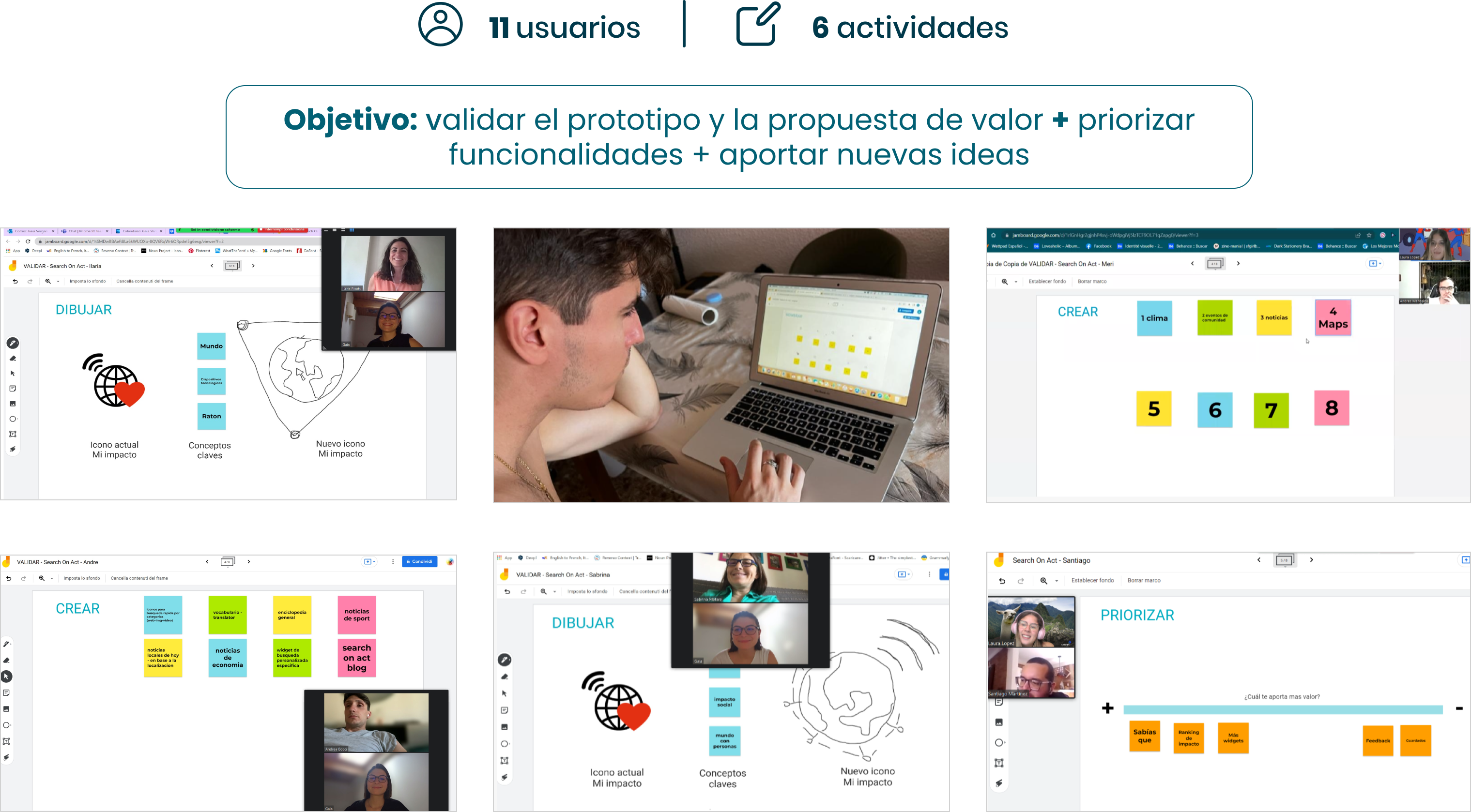
In the last stages of this phase, we thought of adding at the end of the tests a part of co-creation
with our users
through 6 interactive activities related to the prototype to validate it and its value proposition,
prioritize functionalities that they valued the most, and generate new ideas.
It has been a very interesting and useful activity as well as really entertaining, as it has given
us many insights on improvements that we could do and also confirmed doubts that we had, and above
all, we have
been able to generate together with the users more than 65 new ideas for future features that they
would like to have!
— Desktop VS Mobile
As seen from the images displayed so far, we started working on the desktop version of the product at
the beginning of the project, but we later decided to prioritize mobile for
the moment because lots of users and our chosen archetype, the "always connected", are mostly mobile
users, as they also described it as an "extension of their hand".
Moreover, we liked the possibility of designing this version in order to learn and apply the
mobile-first design mentality.

— Backlog and MVP
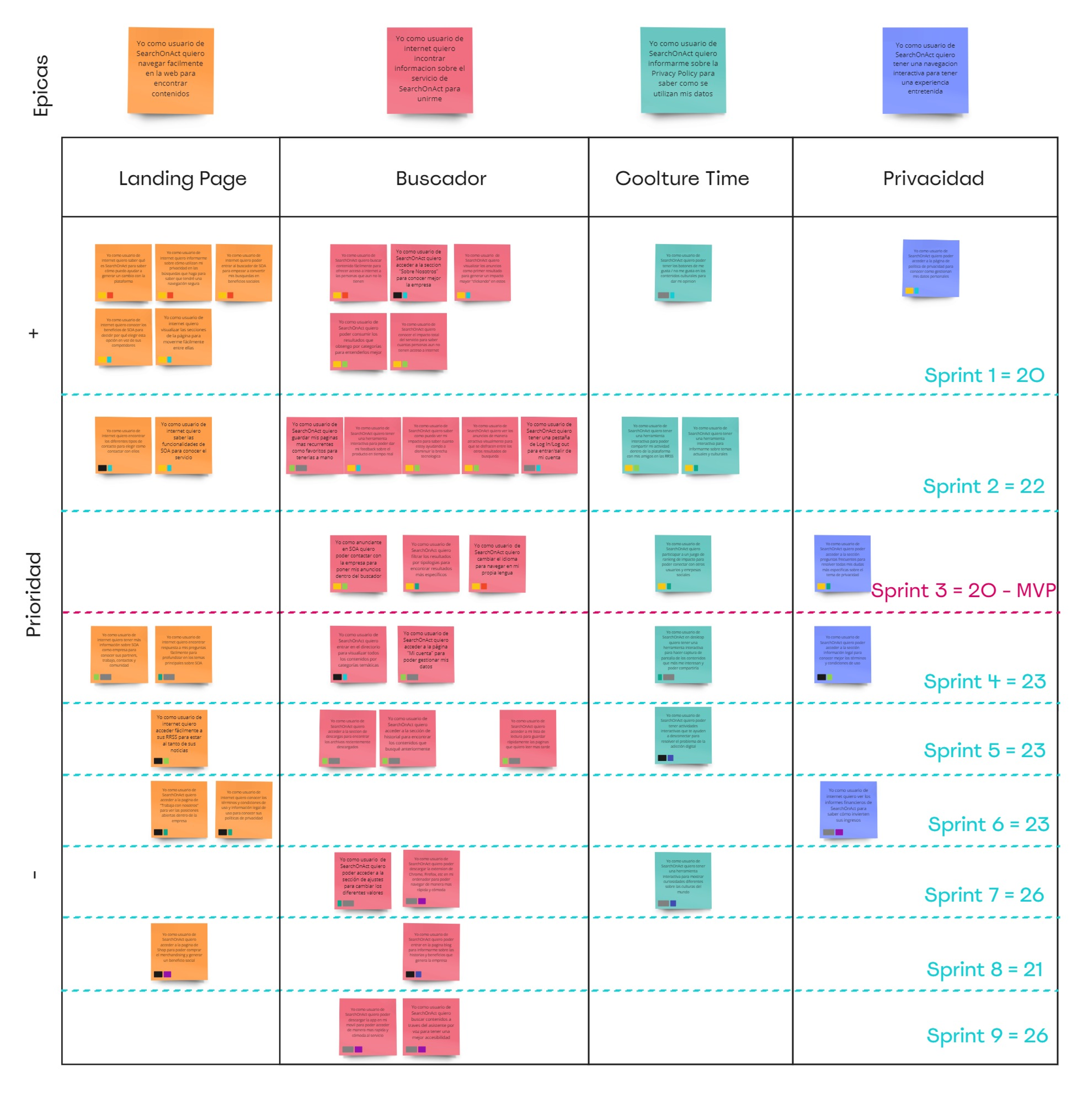
To summarize what we have said so far and before showing in detail the MVP of our prototype,
I'd like to introduce the backlog or road map of this project for a better understanding and to
show that we have been able to deliver the MVP in 3 sprints.
In the image below, you can see our 4 big headlines or epics that summarize the user needs or
user stories
that we have been
continuously interrogating, to see how we have executed each of them from test-derived decisions.
Thanks to this constant iteration, you will see that the "coolture time" epic has now become
"widgets" and we use the term "website" when referring to the "landing page" as it has grown into a
complete website.
Epic 1 - Landing Page
"I, as an internet user, want to find information about SearchOnAct's service to join and learn
about
it."
We have solved this need through the website in the about section and in the product, where from the
setting menu on the homepage you can easily
enter the about us, FAQ, or terms and conditions sections to have all the information available.
As you can read from this first epic and the next, our focus has been on differentiating
between new users (who
don't know the
brand and will go to the landing page for info) and users who are already moving into our product,
as both will have different needs.

Here you can see the sitemap that illustrates the hierarchy of the content across a website and the expected user flows. Tests were made at this point using various card sorting activities.
Epic 2 - Search Engine
"I, as a SearchOnAct user, want to easily browse the web to find content."
We have solved this need by delivering search results for categories (web, news, images, and videos)
plus an important part for visual interactive ads which are essential to generate new internet
connections.
Thanks to the last feedback of our users we have added the possibility to "close" the ad after a
few that you
discard if they are not of your interest, but at the same time by appealing to the moral sense of
the users and making
clear in writing that the ads are a fundamental part to continue generating impact.
Epic 3 - Widgets "Coolture Time"
As a SearchOnAct user,
I, as a SearchOnAct user, want to have an interactive navigation so that I can enjoy an
entertaining experience.
For this epic, we have generated 5 widgets - available so far - that allow customizable
functionalities, such as a "did you know" that tells each time new curious facts about the digital
divide, a "user and social partners ranking" that we developed to implement the engagement toward
the
generation of new internet connections through gamification, a "saved items" folder where you can
group your searches in customizable dashboards with names and categories, a "feedback" and a "more
widgets" part where users can get in touch with us and we can learn from them in order to always
delivers value.
Epic 4 - Privacy
I, as a SearchOnAct user, want to find out about the Privacy Policy so I know how my data is
used.
We have solved this on our website through the FAQ section where we explain how SearchOnAct protects
the
privacy of each user. And we have also solved it in the product, where from the setting section on
the homepage you can easily access the terms and
conditions and see more in detail how we use the users' data and how we
protect their privacy.

— Business Model Canvas
Once all the design part of our project was developed, we went on to define the business model part, which is central to understanding how SearchOnAct would work in reality.
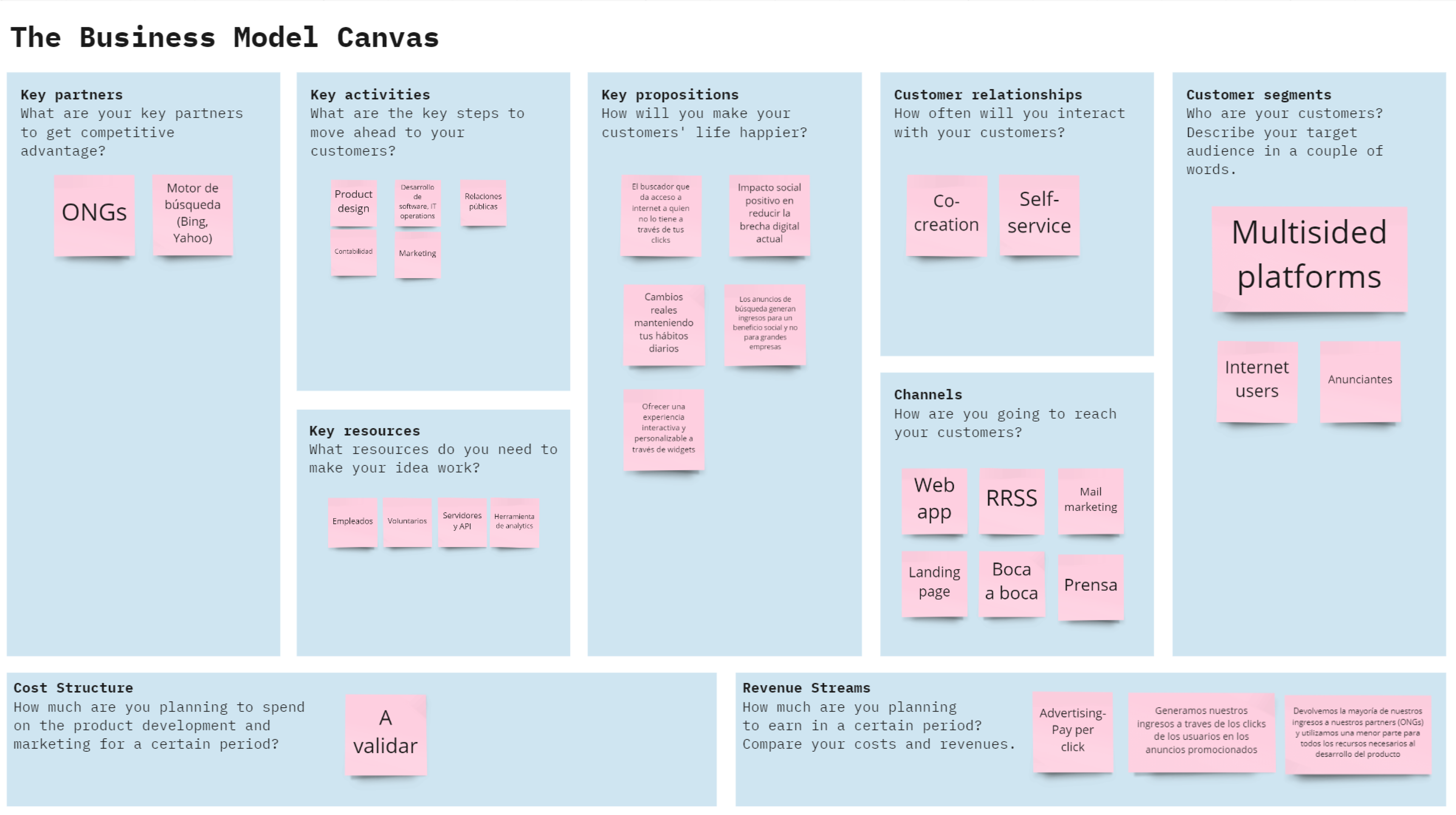
It was also very useful in defining and specifying the actors involved, the resources
required,
our core values for a Unique Value Proposition, as well as the users we are targeting, the type
of
relationship we want to have with them, and the channels we
are going to use to do this.
And last but not least, the revenue streams, or sources of income, that we have based on a
pay-per-click advertising business model in which we generate our revenue through user clicks
on
promoted ads
and we return most of our revenue (70%) to our social partners and use a smaller part for all the
necessary
resources for the product development.
Through this business-oriented part, we were able to understand on a general scale how to unite all the actors involved in generating this change and above all to ideally have a clear and long-term measurable goal.

Web app prototype
In these last sections, you can see the Figma prototypes both for the digital product prototype and
for the website.
Once you are logged in, you can navigate it and surf the web with a preset search - please consider
that there might be some user flow limitations, but we are always looking for improvement.
As already said, the desktop version of Search On Act is still a work in progress, but you can see
and navigate through a few pages to see how it would appear visually.
Please, enjoy! :)
— PROTOTYPE MOBILE

