-
MOOD APP
-
UX / UI design
-
2022
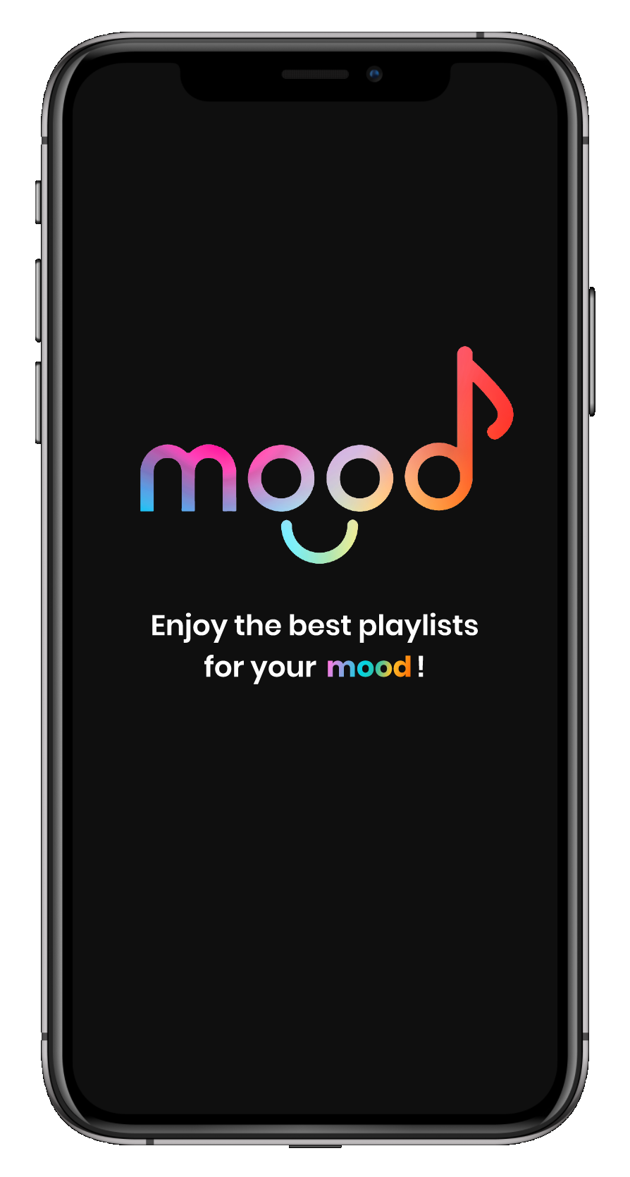
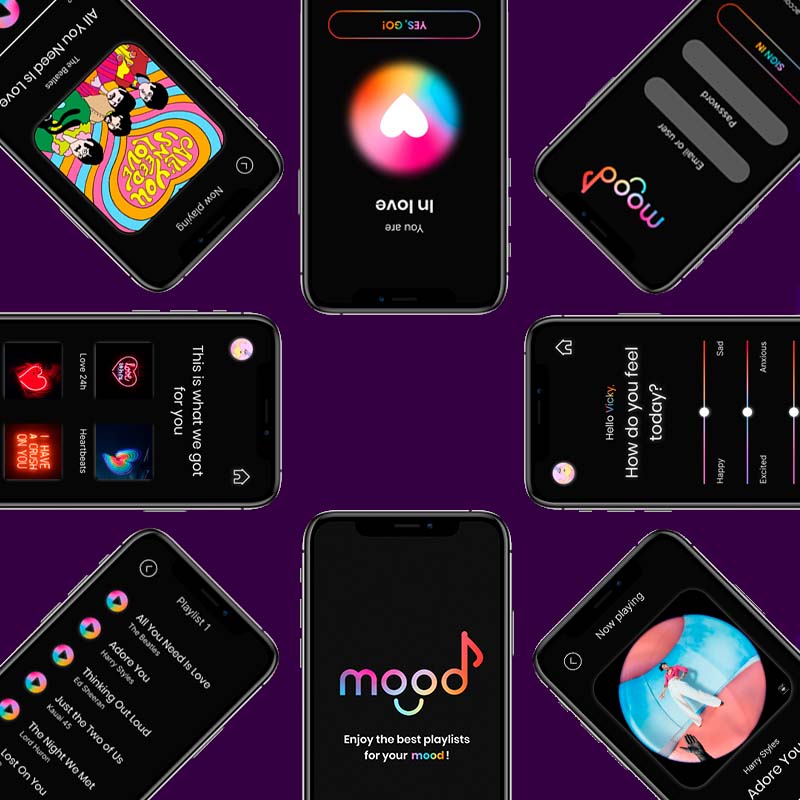
Mood App is the app that suggests you the music to listen according to your mood of the moment. It’s
easy: choose how are you feeling today and wait for our system to scan your emotions, in just a few
seconds Mood App will suggest you some playlist with all the best songs suitable for you, or if you
choose to trust your emotions you can start listening by following the flow.
The purpose of this project is to experiment and apply different way of transitions and animations
by creating an interactive music app. The concept starts from a brief user research, which objective
is to discover the real needs and expectations of such kind of app users: a personalised and
interactive service, quick accessible content in line with their needs.
value proposition
∗ Design a user flow that is coherent with the animations and interactions showed
∗ Develop a full experience from log-in to listening
∗ Express mood and music through a consistent guide style and colors

wireframing
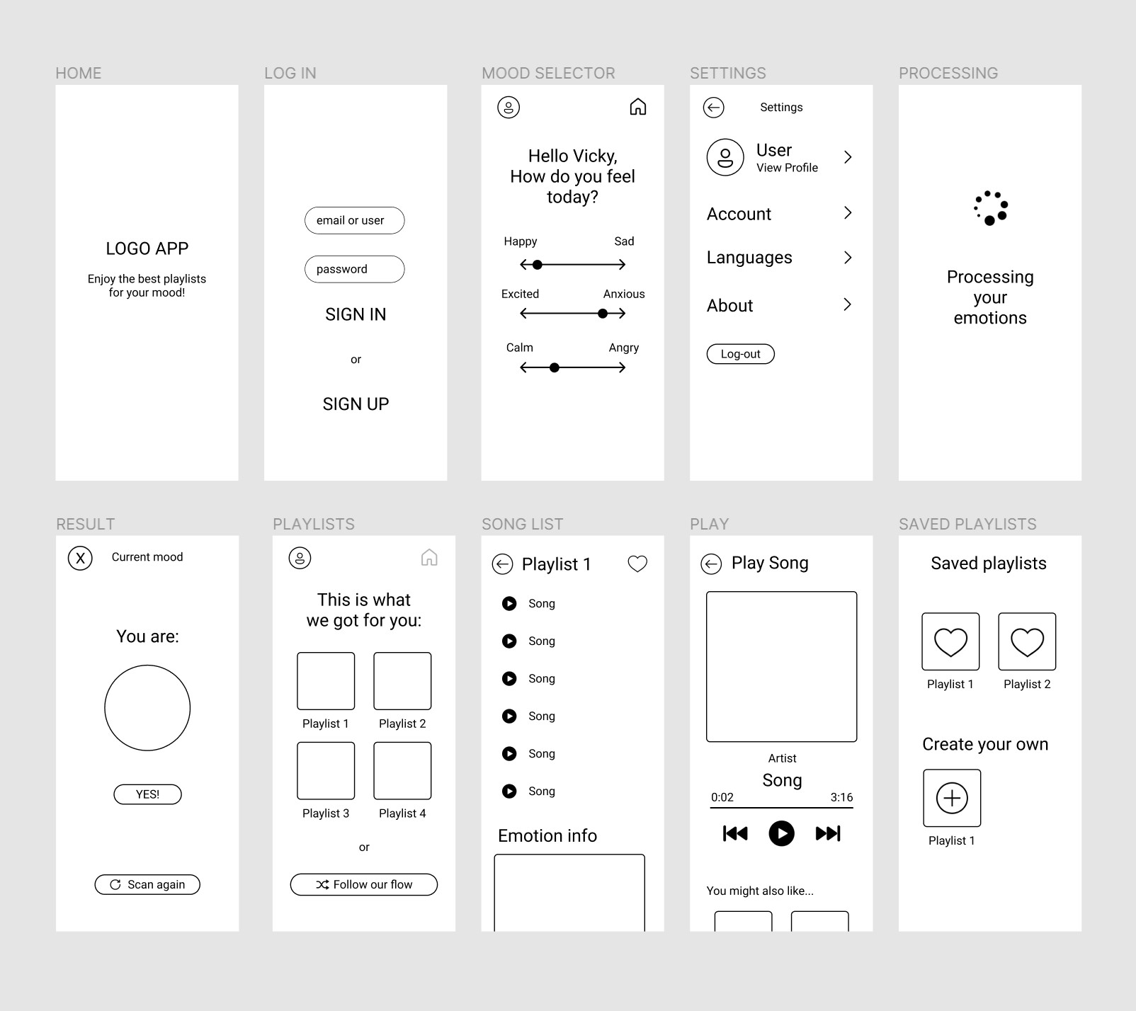
Before starting thinking about the art direction, it is essencial to prepare wireframes. A lo-fi
wireframe can be a very useful tool to convey the concept, organise elements and identify layout
problems.
As for this exercise we didn't have specific rules to follow, except the ones related to what the
user flow should contain, the first step for this project was
to locate and structure the whole flow into wireframes and made sure it was complete and coherent.
It was important that it contained 3 sections:
- Log-in
- Mood selector
- Recommended result
I made a first draft drawing them by hand
and then I choose to recreate the design digitally on Figma to speed up the work and try since the
beginnig if the flow was fluid.

moodboard
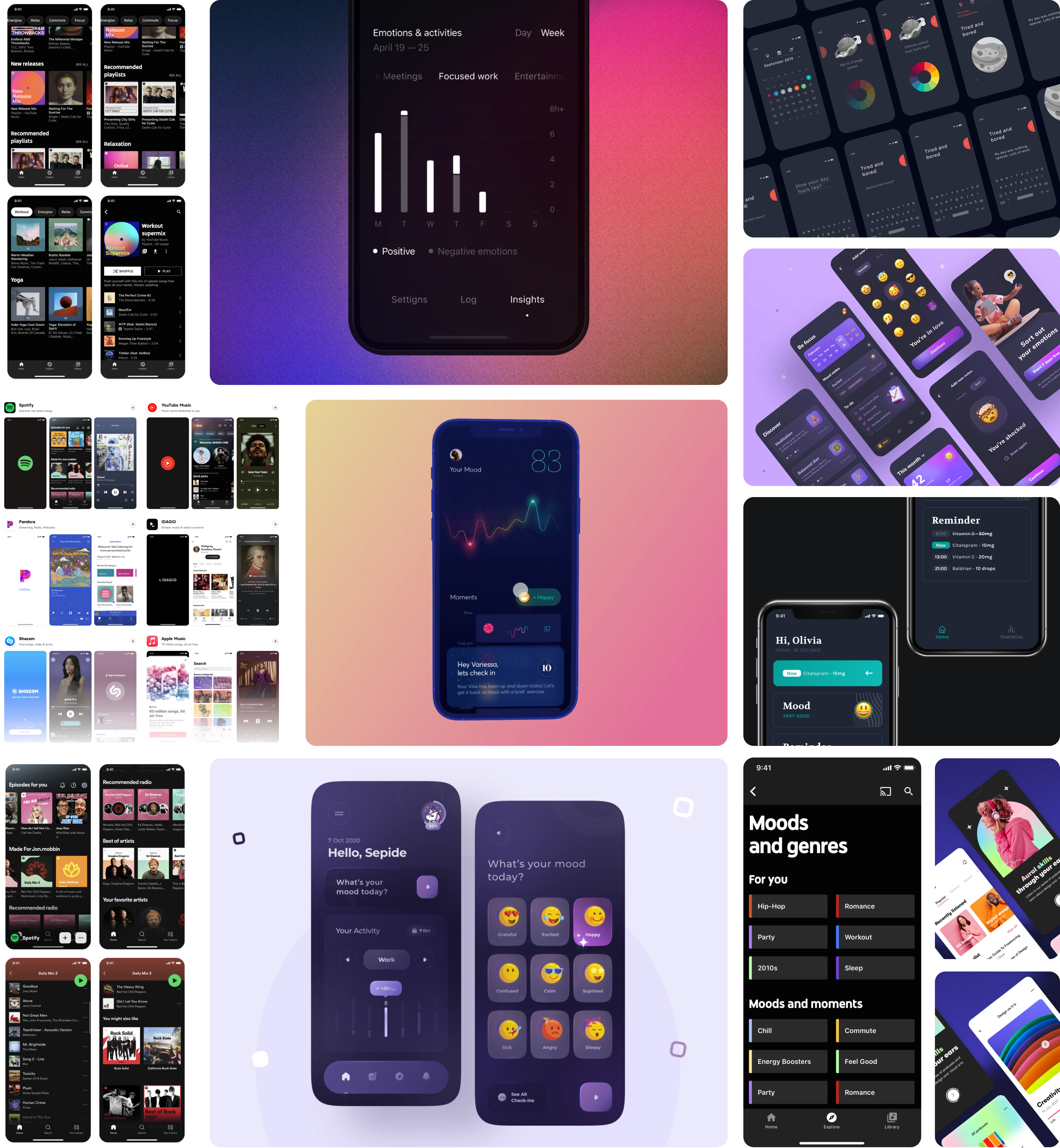
Next, I started to search for inspiration that could help me set the mood. Also, driven by with the specific purpose of designing an app, I carefully took into account the already existing designs for the most popular music apps by searching on Mobbin. Below you can see the result of my search condensed in a moodboard.

style
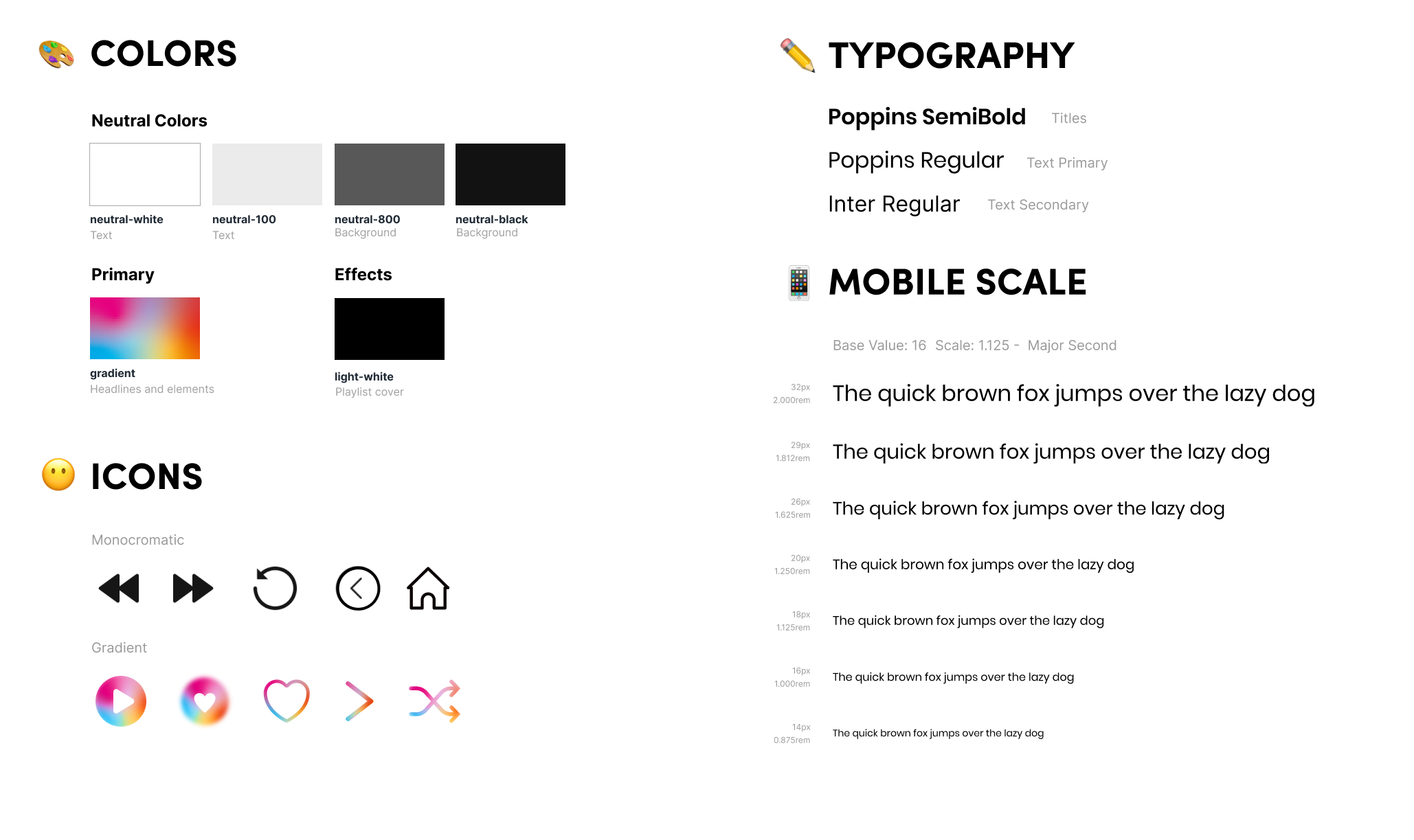
The next thing to do was to define the style guide, colors and typography to give a definied identity to the app which would communicate the essence and the finality of this digital product. In this step of the design process I started by preparing my strategy to better convey Mood concept and personality by putting together all the inpiration I took from my research into the logo that you can see below.
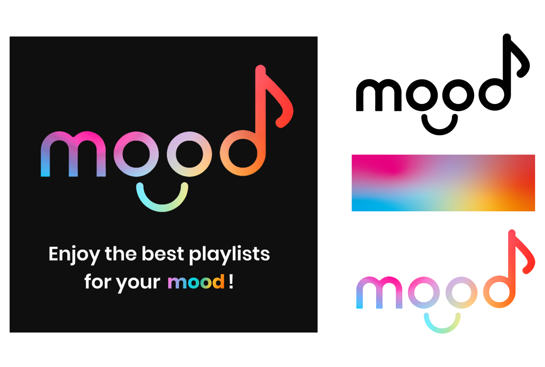
I choose the carachteristic sans-serif Poppins typeface for titles and primary text, and Inter as a second lighter typeface for smaller texts. Using different weights helps in readability, usability and accessibility. To give order and scalability, speed up the design and, above all, give a visual hierarchy, I use the "Major Second" typographic scale. The color palette used is simple, mainly made by the contrast between the neautral tones and the bright and coloruful gradient that is used all over the app to express the constantly chaning mood of the user. Almost the same goes for the icons chosen: they are simple and flat to guide the user throught clear and coincise actions, while some have the same colorful gradient that is used to convey attention and connect to the emotionality of the user in certain moments during the flow. Finally I decided to use a clear, concise and useful ux writing to put the user in context, and guide him towards his goal: enjoying the right music for his mood.

prototype
Finally, after tests, trials, and errors, I came up with the design that you can see and navigate
below which will lead the user from the log-in page to the currently playing page accordingly to the
selected mood of the moment.
While design solves universal problems, microinteractions are the special moments you have during
the user experience. UX animation is not an aesthetic resource, but a tool to improve the user
experience, since it produces positive feelings that unconsciously influence the actions of users.
In this case, I used microinteractions that are useful and short, to generate an emotional
connection between the user and the product; to increase the sense of location; to warn that there
is an action in progress; to guide the user and increase the desire to interact with the system.
Please, enjoy! :)

